Bolton Showroom
Opening Times:
Mon-Fri: 8:00am - 5:00pm
Sat: 10:00am - 5:00pm
Sun: 10:00am - 4:00pm
May Bank Holiday Opening Times:
Monday 4th May : 10am - 4pm
Monday 25th May : 10am - 4pm
Design & Ideas

10 Different Ways to Lay Metro Tiles
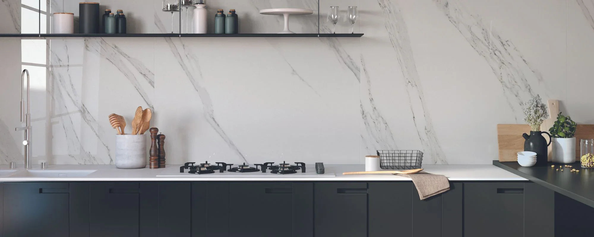
10 Different Ways to Lay Metro Tiles Subway Tile Patterns Few wall tiles have stood the test of time quite like classic metro tiles. First introduced in the early 20th century for New York's underground subway stations, these simple rectangular tiles quickly became synonymous with clean, practical design. Today, metro tiles (also known as subway tiles) have evolved far beyond their humble beginnings, available in countless finishes, textures and different colours to suit every interior style. The beauty of metro tiles lies in their versatility. Using the same tile, you can create an entirely different look simply by changing the layout. Whether you're designing a striking kitchen splashback, refreshing a family bathroom or creating statement feature walls, the right laying pattern can influence how spacious, modern or traditional a room feels. From timeless brick bond layouts to bold vertical herringbone designs, here are 10 different ways to lay metro tiles, and how to choose the perfect style for your home. 1. Classic Brick Bond The classic brick bond is the most popular metro tile layout, and one that never goes out of style. Also known as a running bond pattern, each row is offset by half a tile to create the familiar staggered look inspired by traditional brickwork. It's a timeless choice that works beautifully in both classic and contemporary homes. The horizontal lines help create the illusion of wider walls, making it ideal for kitchen splashbacks and bathrooms alike. Perfect for: Kitchen splashbacks Family bathrooms Utility rooms Traditional and modern interiors 2. Horizontal Stacked Layout A horizontal stacked layout gives metro tiles a clean, contemporary feel. Instead of staggering each row, the tiles are aligned in a precise grid pattern, creating crisp grout lines and an orderly finish. This simple layout works particularly well in minimalist kitchens and modern bathrooms, where symmetry is key. Pair with matching grout for a seamless look or contrasting grout to emphasise the geometric design. 3. Vertical Stacked Turning the same metro tile vertically is a simple way to transform the look of a room. A vertical stacked layout draws the eye upwards, helping ceilings appear higher and making smaller spaces feel more open. The uninterrupted grout lines create a sleek, contemporary finish that's perfect for shower walls, cloakrooms and compact bathrooms. Sometimes, the simplest layouts make the biggest impact. 4. Horizontal Herringbone If you want to introduce movement and texture, horizontal herringbone is a timeless favourite. Each rectangular tile is laid at a 45-degree angle, creating the distinctive zig-zag effect that instantly adds visual interest. It's a more intricate pattern, but one that brings a luxurious, designer feel to kitchen splashbacks, shower walls and feature areas. 5. Vertical Herringbone Vertical herringbone offers a fresh take on a classic layout. By rotating the traditional herringbone pattern upright, it creates a greater sense of height while adding a contemporary edge. It's particularly effective in compact bathrooms, where it can make walls feel taller and draw attention to statement features like freestanding baths or vanity units. 6. Chevron Pattern Often mistaken for herringbone, the chevron pattern creates a continuous 'V' shape rather than overlapping tiles. The result is a bold, structured design with a clean, modern aesthetic. Whether used on a feature wall or as a striking kitchen splashback, chevron styles make an instant statement. 7. Vertical Third Bond A Vertical Third Bond is a modern twist on the classic running bond. Instead of a half-tile offset, each row is staggered by a one third offset, creating a softer, more contemporary rhythm. This layout works particularly well with longer metro tiles and offers a subtle update on a timeless favourite. 8. Diagonal Metro Tiles For something a little different, try laying metro tiles diagonally. Changing the angle creates movement and helps reduce the corridor effect often found in long, narrow spaces. Diagonal layouts work particularly well on feature walls and splashbacks, adding character without overwhelming the room. 9. Double Weave The Double Weave layout combines horizontal and vertical tile arrangements to create the appearance of woven texture. It's a more unusual pattern, making it ideal for feature walls or boutique-inspired bathrooms where you want the tile design to become a focal point. 10. Grid Pattern A grid pattern celebrates simplicity. Every tile is perfectly aligned both horizontally and vertically to create a symmetrical, balanced finish. This clean layout complements contemporary interiors and works especially well with handmade-effect or coloured metro tiles, where subtle variations in texture become part of the design. Which Metro Tile Pattern Makes a Room Look Bigger? One of the biggest advantages of experimenting with different metro tile laying patterns is their ability to change how a room feels. The direction of the tiles, the placement of the grout lines and the overall layout can all influence the perception of space. Pattern Best For Creates the Illusion Of... Classic Brick Bond Traditional kitchens & bathrooms Wider walls and a timeless feel Horizontal Stacked Contemporary interiors Clean, open spaces with crisp lines Vertical Stacked Small bathrooms & cloakrooms Higher ceilings and a greater sense of height Vertical Brick Bond Narrow spaces Taller, more elegant walls Horizontal Herringbone Feature walls & splashbacks Added depth, texture and movement Chevron Pattern Modern statement spaces Dynamic flow and visual impact Diagonal Layout Compact rooms A more spacious feel by reducing the corridor effect If you're working with a smaller room, choosing the right layout can make a surprising difference. Vertical layouts naturally draw the eye upwards, while horizontal patterns can visually widen a space, making even compact bathrooms or galley kitchens feel more balanced. Grout Can Completely Transform the Look The tile layout may take centre stage, but grout is just as important to the finished design. The colour and width of your grout joints can completely change the character of the installation, highlighting your chosen pattern or allowing the tiles to blend seamlessly together. Matching grout creates a smooth, cohesive finish that makes walls appear larger and more continuous. Contrasting grout emphasises the shape of each rectangular tile, making brick bond, stacked and herringbone patterns stand out. Coloured grout adds personality and can complement feature colours, from soft sage greens to bold navy blue or charcoal tones. Whether you're creating a subtle backdrop or a striking feature wall, grout should be considered as part of the overall design, not simply a finishing detail. Which Rooms Suit Metro Tiles? One of the reasons metro tiles have remained a timeless choice since the early 20th century is their incredible versatility. Available in a huge range of colours, finishes and textures, they can be adapted to almost any room in the home. Metro tiles work beautifully in: Kitchen splashbacks Full-height bathroom walls Shower enclosures Cloakrooms and guest WCs Utility and boot rooms Home bars Fireplace surrounds Feature walls Laundry rooms Hallways and entranceways Whether you're creating a classic white subway tile splashback or a bold contemporary feature wall using coloured metro tiles, there's a layout to suit every space. Choosing the Right Metro Tile Pattern With so many creative layouts to choose from, selecting the right pattern comes down to both the proportions of your room and your personal style. Before making a decision, consider: The size and shape of the room Ceiling height Natural light levels Whether you're aiming for a traditional or contemporary aesthetic The size and proportions of your metro tiles Whether you want the pattern to become a focal point or blend into the background A simple horizontal stacked layout offers understated sophistication, while classic brick bond delivers a timeless look that never goes out of style. If you're looking to introduce more movement, herringbone or chevron patterns create beautiful visual texture and are ideal for feature walls and statement splashbacks. If you're unsure which layout is right for your project, visiting a Roccia showroom allows you to see different laying patterns, tile colours and grout combinations side by side, helping you visualise the finished result before installation begins. Conclusion Metro tiles have earned their place as one of the most enduring choices for kitchens and bathrooms, offering a perfect balance of practicality, versatility and style. Yet it's often the laying pattern, not just the tile itself, that defines the finished look. Whether you love the timeless appeal of a classic brick bond, the clean simplicity of a stacked layout or the striking elegance of vertical herringbone, experimenting with different metro tile patterns is an easy way to personalise your home while creating a space that feels both contemporary and enduring. At Roccia, our extensive collection of metro and subway tiles includes everything from traditional gloss finishes to handcrafted textures and bold contemporary colours. Visit one of our showrooms to explore the collections in person and discover how the right tile, and the right layout, can completely transform your kitchen or bathroom.

How to Style Brown Tones to Bring Warmth and Depth Into Your Home
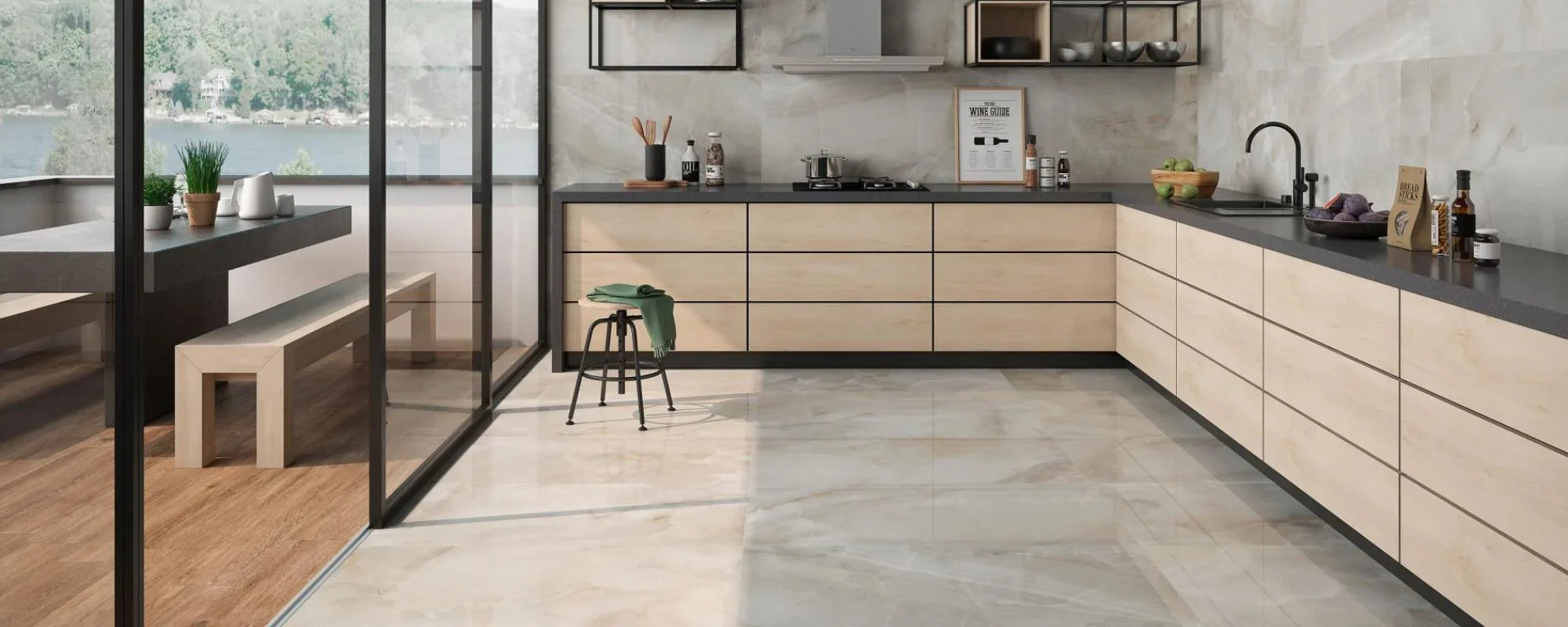
How to Style Brown Tones to Bring Warmth and Depth Into Your Home Brown is having a moment in interior design. After years of cool greys and stark white schemes, homeowners are embracing warmer palettes that feel more inviting and connected to nature. From walnut kitchen cabinetry and stone-effect tiles to chocolate brown furniture and earthy accessories, brown tones are helping create interiors with greater depth, character and comfort. The appeal of brown lies in its versatility. It can act as a neutral backdrop, a statement colour or a subtle accent depending on the shade and how it's used. Whether you're redesigning a bathroom, planning a new kitchen or refreshing a living space, brown offers a timeless way to add warmth without overwhelming a room. Why Brown Is Back in Interior Design The return of brown reflects a wider shift towards natural materials and more lived-in interiors. Rather than creating spaces that feel overly polished, homeowners are looking for rooms with texture, warmth and personality. Brown works naturally within this movement because it already exists in many of the materials we love, including wood, stone, clay and leather. Unlike trend-led colours that can quickly date, brown feels familiar and enduring. It helps a room feel grounded while still offering plenty of flexibility. Understanding Different Shades of Brown One of the biggest misconceptions about brown is thinking of it as a single colour. In reality, there are countless brown shades, each creating a different mood. Taupe and Soft Beige Taupe is a cool-toned neutral that blends brown and grey, making it an excellent choice for contemporary interiors. These softer shades work beautifully on walls, tiles and larger surfaces where warmth is wanted without making the room feel darker. Walnut and Caramel Walnut brown and caramel shades sit comfortably in the middle of the spectrum. Tan and camel sit in this same lighter-to-mid brown family and are classic warm tones often seen in outerwear. These colours add natural warmth, and a caramel shade works particularly well in kitchens through cabinetry, shelving and wooden furniture. They pair beautifully with marble-effect surfaces, stone finishes and warm metallic details for a balanced look anchored by a warm shade. Chocolate Brown and Dark Brown Chocolate brown and deeper brown hues create a rich atmosphere, with chocolate brown offering a modern alternative to black. Espresso is the darkest shade in the brown family and gives fashion a strong, grounding base. Used thoughtfully, a dark brown feature wall, vanity unit or kitchen island can become a focal point that adds depth and visual interest without feeling overwhelming. Mahogany is a reddish-brown choice that works especially well in polished accessories or smaller accents. The key is balancing darker tones with lighter surfaces and plenty of natural light. How to Layer Brown Tones Successfully The most successful brown interiors rarely rely on a single shade. Instead, they combine different shades of brown to create depth and contrast. A room might feature durable stone-effect floor tiles alongside: Walnut brown cabinetry A warm stone-effect floor Cocoa brown textiles Subtle brown accents through accessories Aged gold hardware This layered approach creates a cohesive look while allowing each material to stand out, and incorporating high-quality brown tiles on floors or feature walls can further unify the scheme. Texture also plays an important role. Combining smooth stone, natural wood, woven baskets and soft fabrics prevents brown from feeling flat and adds warmth to the overall design. Brown and Natural Materials Brown works best when paired with natural materials. Wood-paneled walls are also returning in modern designs, offering another natural way to bring in brown tones. Stone, marble, wood and clay all contain earthy tones that complement brown naturally. This is why brown feels so effortless in kitchens and bathrooms where material choice plays such a significant role, and why brown paint can work so well as a comforting shade alongside natural stone-effect tiles and these finishes. At Roccia, we're seeing growing demand for warm stone-effect porcelain, travertine-inspired surfaces and marble-effect tiles with subtle brown veining. These materials introduce natural warmth while remaining timeless and practical. Rather than relying on paint alone, homeowners are increasingly using surfaces to shape the atmosphere of a room. Styling Brown Tones in the Kitchen Brown has become one of the most desirable colours in modern kitchen design, especially when used through brown kitchen tiles that add warmth and texture. Walnut brown cabinetry introduces warmth while maintaining clean lines and a contemporary aesthetic. It feels softer than black yet more distinctive than white. Pair Brown Cabinets With Stone Surfaces Brown cabinetry works beautifully alongside: Travertine-effect tiles Limestone-inspired flooring Marble-effect worktops Warm neutral splashbacks The combination creates a kitchen that feels elegant and connected to nature. Introduce Warm Metallics Brown pairs beautifully with aged gold, brushed brass and bronze finishes. These metallics enhance brown's natural warmth and add a subtle sense of luxury without feeling overly decorative. Bringing Brown Into Bathroom Design Bathrooms often benefit from warmer palettes. While white bathrooms remain timeless, brown tones create a softer, more spa-inspired atmosphere. Choose Warm Stone-Look Tiles Travertine, limestone and marble-effect stone-effect bathroom tiles introduce earthy tones while maintaining a clean and contemporary feel. Using similar surfaces across floors and walls, such as coordinating stone-effect wall tiles, helps create a seamless finish and allows the room to feel larger. Add Warmth Through Furniture A walnut vanity unit or wood-effect surface can instantly make a bathroom feel more inviting. Combined with brushed brass fittings and soft lighting, these elements create a bathroom that feels calm and relaxing rather than clinical. The Colours That Pair Beautifully With Brown One of brown's greatest strengths is how well it works with other colours. Brown and Green Olive and sage green reinforce brown's connection to nature and create a calm, organic palette. Brown and Dusty Blue Dusty blue works beautifully with brown tones, creating a balance between warmth and coolness. This combination feels sophisticated and can work wonderfully in the living room, while also helping create tranquil bedroom settings. In a living room, wood-paneled walls add extra warmth and character alongside this palette. Brown and Soft Blush Soft blush introduces a gentle contrast that softens deeper brown shades and creates a more contemporary feel. Brown and Jewel Tones For a richer look, brown looks great with jewel tones such as emerald and sapphire. Used through accent chairs, wall art or decorative accessories, these colours bring depth while maintaining a luxurious feel. Common Mistakes to Avoid When decorating with brown, there are a few pitfalls worth avoiding. Using One Shade Everywhere Combining multiple brown tones creates more depth than repeating the same colour throughout the room. Ignoring Undertones Some brown colours have red undertones, while others lean towards grey or beige. Always compare materials together before making a final decision. Forgetting About Lighting Brown responds beautifully to warm light, but cool lighting can make it appear flat. Always view samples in both natural and artificial light. Creating a Warm Home With Roccia Brown interiors are about more than colour. The most successful spaces combine beautiful surfaces, natural materials and carefully chosen textures to create warmth and character, reflecting current design trends. Whether it's a travertine-inspired bathroom, a walnut kitchen or a living space layered with earthy tones, the right materials help bring the scheme together. Practical details matter too, and brown rugs hide wear and tear better than lighter shades. At Roccia, our collections of stone-effect, marble-effect and wood-inspired surfaces make it easy to introduce brown tones in a way that feels timeless, sophisticated and practical for everyday life, with expert tips for styling details like terracotta pots. Final Thoughts Brown is no longer a colour reserved for traditional interiors. From taupe and caramel to walnut and chocolate brown, today's brown palette offers endless possibilities for creating warm, inviting spaces. When layered thoughtfully with natural materials, complementary colours and the right textures, brown can add depth, character and natural warmth to every room in the home. The result is an interior that feels comfortable, timeless and designed to be lived in, not just admired.

Patterned Tiles for Kitchens and Bathrooms: How to Add Character Without Overwhelming Your Space
Patterned Tiles for Kitchens and Bathrooms: How to Add Character Without Overwhelming Your Space Patterned tiles have a unique ability to completely transform a room. They add character, texture and visual interest in a way that plain surfaces often can't, helping kitchens and bathrooms feel more considered, layered and personal. Yet despite their popularity, many homeowners still hesitate when it comes to introducing pattern into their interiors. There’s often a concern that patterned tiles will feel too busy, too bold or quickly become dated. In reality, when used thoughtfully, patterned tiles can be one of the most timeless design choices you can make. The secret lies in balance. The most successful contemporary interiors don't rely on pattern everywhere. Instead, they use decorative tiles strategically to create a focal point, add architectural depth or introduce subtle texture into a space. Whether it's a patterned floor in a bathroom, a statement splashback in a kitchen or a striking feature wall, patterned tiles can bring personality without overwhelming the room. Patterned tiles for kitchens and bathrooms have a surprisingly rich history too. Their origins can be traced back to Ancient Greece and the Roman Empire, where decorative surfaces were used to create highly ornate interiors. Centuries later, the Victorian era marked the height of patterned tile popularity, particularly with the introduction of mass-produced encaustic tiles during the Industrial Revolution. Today, modern ceramic tiles, patterned porcelain collections and decorative wall tiles continue to bring that same sense of beauty, elegance and character into contemporary homes. Why Patterned Tiles Continue to Shape Contemporary Interiors Over the past few years, interiors have started to move away from ultra-minimal spaces dominated by plain surfaces and cool grey palettes. Instead, homeowners are looking for ways to create warmth and individuality. Patterned tiles offer exactly that balance. They add visual interest through the architecture of a room itself rather than relying solely on accessories, furniture or decoration. What makes today's patterned tiles feel particularly relevant is their versatility. Modern collections range from subtle geometric patterns and tonal designs to Mediterranean-inspired motifs, vintage encaustic styles and handcrafted decorative finishes. Rather than dominating a space, these contemporary designs work alongside natural stone, wood, porcelain and warm neutral tones to create interiors that feel layered and lived-in. The trend for 2026 is also moving towards warmer neutrals, earthy tones and tactile surfaces. Beige, terracotta, soft blue accents and handcrafted textures are increasingly replacing cooler palettes, making patterned tiles an ideal way to introduce warmth while maintaining a timeless aesthetic. The Most Popular Patterned Tile Styles Right Now One of the reasons patterned tiles remain so popular is the sheer variety of styles available. Geometric Patterns for Contemporary Spaces Geometric patterns continue to be a favourite within contemporary interiors because they feel clean, architectural and versatile. Whether arranged in square, rectangle or hexagon formats, geometric tiles can add movement without feeling overly decorative. Simple monochrome designs, repeating linear motifs and tonal geometric patterns all work beautifully in modern kitchens and bathrooms. These styles often pair particularly well with matt finishes, natural stone surfaces and minimalist cabinetry. Mediterranean and Moroccan-Inspired Tiles Mediterranean and Moroccan tiles remain some of the most sought-after decorative tiles on the market. Inspired by traditional craftsmanship, these collections often feature intricate patterns, terracotta tones, deep blue accents and a softer, more organic feel. From colourful patchworks to monochrome geometric motifs, Moroccan-inspired patterned porcelain can bring elegance and warmth to both traditional and contemporary spaces. They work particularly well in kitchens where homeowners want to introduce colour and personality without committing to bold cabinetry or statement furniture. Vintage and Heritage-Inspired Designs Vintage-inspired patterned tiles continue to bring charm and character to modern homes. Many contemporary collections take inspiration from Victorian encaustic flooring, combining classic motifs with the durability of modern porcelain and ceramic materials. These designs feel timeless because they are rooted in architectural history rather than short-lived trends. Used on floors, splashbacks or even hallways, they offer a beautiful balance between traditional design and modern practicality. Where Patterned Tiles Work Best in Kitchens and Bathrooms One of the biggest misconceptions about patterned tiles is that they need to cover an entire room. In reality, some of the most successful designs use pattern selectively. Creating a Kitchen Splashback That Feels Like a Feature A tiled kitchen splashback is one of the easiest ways to introduce decorative tiles into a kitchen. Because the area is relatively contained, it allows pattern to become a focal point without overwhelming surrounding cabinetry or worktops. Pairing patterned wall tiles with simpler materials elsewhere creates a balanced look that feels both contemporary and timeless. Using a Patterned Floor to Anchor a Kitchen Patterned floor tiles can also work beautifully in open-plan kitchens. Using a distinct patterned floor beneath a kitchen island or cooking area helps visually anchor the kitchen and separate it from adjoining dining spaces without introducing physical barriers. It's a subtle design technique that can make a big difference to how the room feels and functions. This approach works particularly well in larger spaces where zoning helps create a sense of structure. Patterned Bathroom Floors That Add Character Bathrooms are another ideal setting for patterned floor tiles. A decorative floor can instantly elevate the entire room, introducing texture and visual interest while remaining highly practical. Many patterned porcelain tiles are particularly forgiving when it comes to everyday wear, helping disguise dust, marks and minor stains more effectively than plain surfaces. Pairing a patterned floor with simpler wall tiles often creates the most sophisticated result. Feature Walls and Statement Moments with Patterned Wall Tiles Patterned wall tiles can also be used to create feature walls behind vanities, freestanding baths or within shower enclosures. Rather than covering every wall, focusing pattern in one area allows it to become a focal point while maintaining a sense of calm throughout the rest of the room. How to Balance Pattern Without Overwhelming a Space The key to using patterned tiles successfully is balance. The most beautiful interiors rarely have every surface competing for attention. Instead, they allow one feature to take centre stage while surrounding materials provide breathing space. Pair Pattern with Simpler Materials Patterned wall tiles often work best when paired with plain wall tiles, natural stone or understated porcelain surfaces. This contrast allows the pattern itself to become the feature while helping the overall design feel more refined. Stone-effect porcelain, warm beige surfaces, premium patterned tiles, natural wood accents and neutral paint colours all provide a quieter backdrop that allows decorative tiles to shine. Mix and Match Carefully Mixing and matching different patterned tiles can create a unique and highly personalised design when done thoughtfully. Repeating colours, materials or geometric details across multiple surfaces helps maintain cohesion. The goal is to create visual interest without introducing too many competing elements. Don't Underestimate the Importance of Grout Grout colour can completely change how a patterned tile looks once installed. Matching grout to the dominant colour within the tile creates a softer, more seamless finish. Contrasting grout, on the other hand, highlights individual shapes and patterns more strongly. Both approaches can work beautifully depending on the overall aesthetic you're trying to achieve. Choosing the Right Material for Patterned Tiles While pattern is often the first thing people notice, material matters just as much. Ceramic Tiles Ceramic tiles remain a popular choice for patterned wall tiles because they are generally easier to cut and install. Their versatility makes them suitable for a wide range of decorative applications, particularly splashbacks and bathroom walls. They also offer an extensive array of colours, patterns and finishes. Patterned Porcelain Tiles Patterned porcelain is often the preferred choice for kitchen and bathroom floors due to its exceptional durability. Porcelain is less porous than ceramic, making it highly resistant to moisture, stains and everyday wear. This makes it particularly suitable for busy family homes where practicality is just as important as style. Encaustic and Cement Tiles Authentic encaustic cement tiles remain a popular option for those seeking a handcrafted appearance. However, because they are more porous, they typically require additional sealing and maintenance compared to ceramic or porcelain alternatives. For many homeowners, porcelain tiles that replicate the look of traditional encaustic designs offer the perfect balance between aesthetics and practicality. Creating a Timeless Look with Patterned Tiles One of the biggest concerns people have about patterned tiles is whether they'll date. The good news is that timeless patterned tiles tend to share a few common characteristics. They often draw inspiration from historical design traditions, use balanced colour palettes and complement natural materials. They feel connected to architecture rather than passing trends. Warm neutrals, soft terracotta shades, muted blues, stone-inspired tones and classic monochrome combinations all tend to have greater longevity than highly trend-led colour schemes. When paired with quality materials and thoughtful design choices, patterned tiles can feel just as timeless as marble, natural stone or traditional wood flooring. Bringing Pattern Into Your Home with Roccia At Roccia, patterned tiles are some of the most versatile collections we offer. From contemporary geometric designs and patterned porcelain floor tiles to Mediterranean-inspired decorative wall tiles and vintage encaustic-look collections, our range is supported by Roccia Engineering’s bespoke tile craftsmanship and is designed to suit both modern and traditional interiors. Whether you're looking to create a statement floor, introduce character through patterned wall tiles or discover a timeless feature for your next renovation project, there are countless ways to use pattern beautifully throughout the home. We always recommend ordering free samples before making a final decision. Seeing a tile in your own home, alongside cabinetry, flooring, paint colours and natural light, is often the best way to understand how the pattern, texture and finish will work within your space. Explore our collection online, visit one of our showrooms or shop samples to find the perfect patterned tile for your project. Final Thoughts Patterned tiles are one of the easiest ways to introduce personality into a kitchen or bathroom. The key isn't using more pattern, it's using it more thoughtfully. When balanced with natural materials, warm colours and simpler surrounding surfaces, patterned tiles can create spaces that feel characterful, elegant and timeless. Whether you're drawn to geometric patterns, Moroccan-inspired designs, vintage motifs or contemporary decorative finishes, the right tile can completely transform the atmosphere of a room. And often, it's these smaller moments of pattern that leave the biggest impression.