How To Choose the Perfect Colour Palette for Your Kitchen
Written by: Halima Bapu
Redesigning your kitchen is an exciting journey. From planning a new layout and choosing tiles to selecting lighting fixtures, there are many decisions to make. However, one of the most challenging aspects for many is picking the perfect colour ideas for their kitchen. Striking the right balance between coordinated colours and avoiding an overly matchy look can be tricky, and understanding which colours complement each other is often more complex than it seems.
In this article, we’ll provide practical colour ideas and inspiration for kitchen colour palettes, including helpful tips on selecting colours for walls, countertops, and cabinets.
That’s why, in today’s blog, we’ve taken on the task of guiding you through how to choose the ideal colour palette for your kitchen. We’ll also explore how current kitchen trends may influence your colour palette choices. Before diving into the science of colour schemes, we’ll start by looking at how to assess the space you’re working with. These considerations will help you determine the best colour scheme for your kitchen. Once you’ve made your choice, our award-winning kitchen design team is ready to assist you in bringing your renovation and remodeling vision to life.
Evaluating Your Kitchen Space: Where to Begin
Before diving into colour charts and trend forecasts, it’s essential to analyse the physical space you’re working with. For example, a large kitchen with abundant natural light and high ceilings offers greater flexibility in choosing darker or bolder colour schemes, as its openness prevents the space from feeling cramped. In such cases, thoughtful design elements and strategic colour choices can ensure that even a cavernous space feels welcoming and lively, rather than empty or overwhelming. Colours interact with light, size, and shape — which means your chosen palette must complement the architecture of your kitchen, not fight against it.
Natural Light and Spatial Perception
Kitchens flooded with natural light offer flexibility; both light and dark tones can work beautifully here. Natural light enhances the ambiance by adding depth to the colours, making the space feel more vibrant and lively. Conversely, if your space lacks daylight, lean towards lighter, reflective colours to open up the area. Pale neutrals, pastels, sage green and soft metallics can amplify available light, while dark tones may absorb it, creating a more enclosed feeling.
Room Size and Layout Considerations
- In small kitchens, lighter hues help create a sense of openness. However, carefully placed darker tones as accents can add depth and avoid monotony.
- In large or open-plan kitchens, you have the freedom to experiment with darker tones. Feature walls, contrasting cabinetry, or patterned tiles in darker shades can break up expansive surfaces and create a cosy, modern atmosphere without overwhelming the space.
Consider the architectural features of your kitchen, such as windows, doors, or alcoves, as opportunities for colour blocking or feature areas to maximise design potential.
The Science Behind the Perfect Colour Scheme
When it comes to interior design, colour palette choices are guided by both aesthetic principles and the psychological impact of colour. While this might not be the first thing on your mind when selecting your kitchen’s colour palette, colours carry meanings and there is a science behind how we incorporate them into our spaces. Certain colours evoke specific moods and associations, such as blue for calmness or red for energy, so understanding colour psychology is essential. Firstly, we would recommend deciding on a base colour, ideally your favourite shade, as this will help reflect your personality and style. This approach simplifies the process by giving you a solid foundation to build upon, allowing you to expand your palette based on your selected colour scheme.
Colours can influence mood, so consider vibrant hues like yellow or bright green to evoke energy and liveliness. Alternatively, opt for neutral or pastel shades to create a warm, calming atmosphere, or choose grey tones for a sophisticated and elegant kitchen. Picking the right colours, including various shades of blue, is essential to achieve the desired ambiance and enhance the overall aesthetic of your space.
After selecting your base colour, you can develop your palette in different ways. A tonal colour scheme involves using multiple shades of your base colour throughout the kitchen, such as different greens. A harmonious palette includes colours adjacent to your base on the colour wheel, like green paired with gold or red with yellow. Lastly, a complementary colour scheme uses colours opposite each other on the colour wheel, such as blue and orange or green and red. While this last option is bold, when executed well, it can give your home a stunning, magazine-worthy look.
Building Your Colour Palette: Design Techniques for Harmonious Results
Choosing the right colour palette isn’t about random selection, it involves strategy. Different kitchen styles, such as modern, farmhouse, or Scandinavian, play a key role in shaping your colour palette and overall design approach. Interior designers often build palettes around three core approaches:
Tonal Colour Schemes
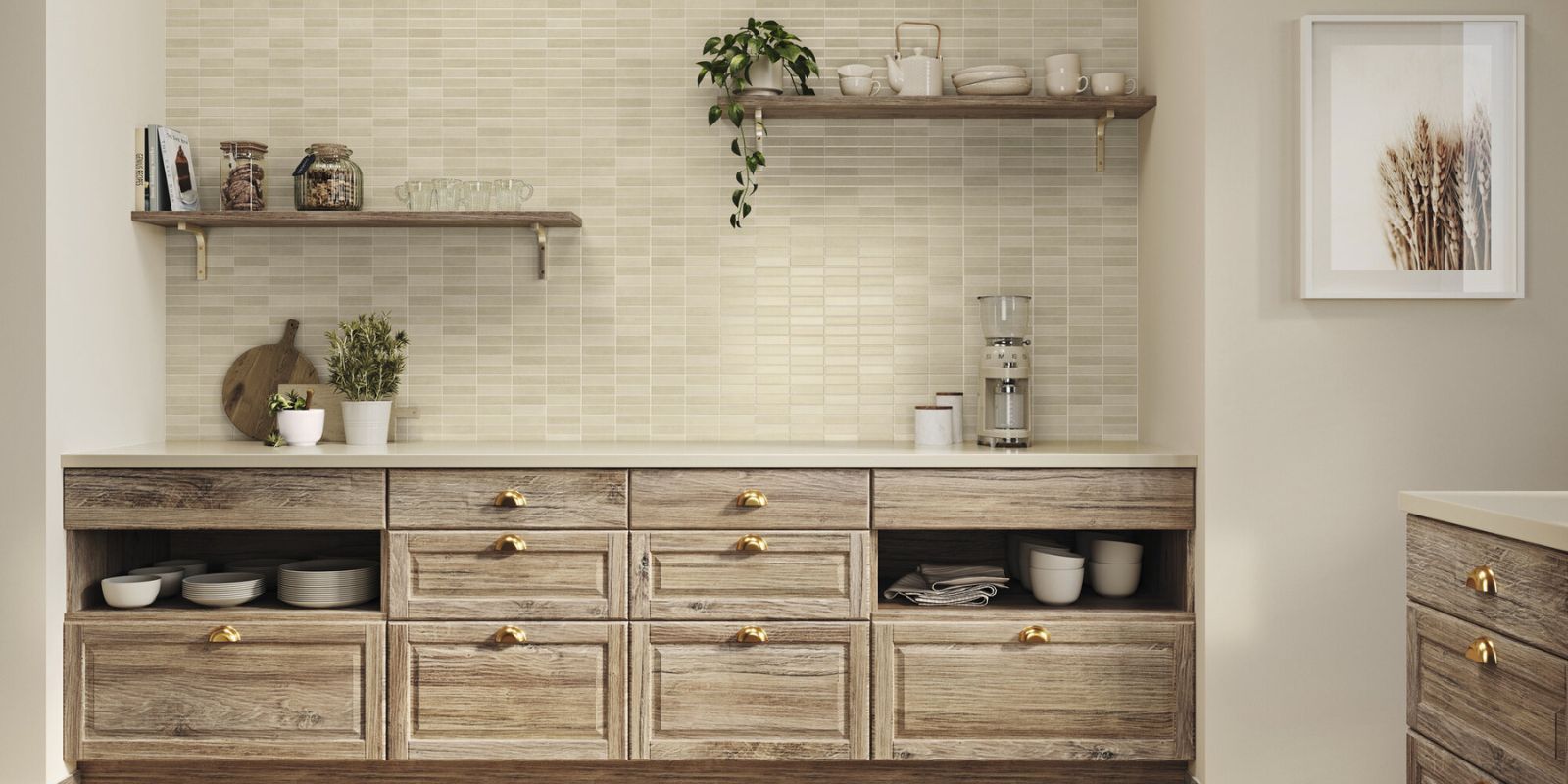
A tonal palette uses multiple shades of the same base colour throughout your kitchen. For instance, varying tones of greens such as mint, olive, or emerald, can create depth without introducing clashing hues. This technique is subtle, sophisticated, and especially effective in modern, minimalist spaces. A cohesive look can be easily created by selecting a tonal palette with blue cabinets and pairing complementary materials.
Harmonious Colour Schemes
This method selects colours adjacent to each other on the colour wheel, for example, soft pinks, dusty reds, and peach tones. Harmonious schemes create gentle, natural transitions between colours, ideal for understated elegance.
Complementary Colour Schemes
For bolder designs, complementary colour schemes emphasise contrasts and visual drama. By pairing two colours that are opposite each other on the colour wheel (such as blue and orange, or green and red), you create visual interest and a high-impact, magazine-worthy aesthetic. Balance is key here, use one colour as the dominant tone and the other as an accent to avoid visual overload.
Starting with Cabinets: The Anchor of Your Kitchen’s Colour Palette
Kitchen cabinets typically cover up to 40% of your kitchen’s surface area, making them the anchor of your kitchen’s colour palette and the largest visual element in the room. Therefore, starting your kitchen cabinets colour planning here ensures a cohesive foundation. When considering custom cabinetry, pay special attention to your lower cabinets, as their colour, material, or finish can significantly impact the overall design and atmosphere.
Choosing Cabinet Colours
Light-coloured cabinets create a clean, airy feel, perfect for smaller kitchens or homes with minimal daylight. Pairing these with white countertops can enhance the sense of space and provide a cohesive, modern look. Alternatively, deep shades such as charcoal, navy, or forest green can add richness and depth to larger or well-lit spaces.
At ROCCIA’s luxury kitchen showrooms, we showcase premium cabinetry from world-renowned brands. For a tailored solution, our Roccia Bespoke range allows you to design custom cabinets that perfectly align with your personal style and spatial needs.
Appliances: An Overlooked Element in Colour Schemes
Colour-coordinated appliances are an underrated way to unify your kitchen design or introduce bold accents. Bold appliance choices are a hallmark of the contemporary kitchen, where vibrant colours and sleek finishes help define a modern aesthetic.
Statement Appliances for Visual Impact
Opt for appliances in contrasting or complementary colours to your cabinetry for a striking focal point. Statement appliances can add interest to the overall kitchen design by introducing visual intrigue and lively design elements. Think a matte black oven against pale grey cabinets, or a scarlet red fridge in an otherwise neutral palette. This approach suits contemporary kitchens aiming for a dynamic, eye-catching look.
Blended Appliances for Seamless Cohesion
For a more understated design, match appliances to your cabinet or wall colour. Integrated ovens, concealed fridges, and colour-matched small appliances help kitchens feel streamlined and uncluttered, ideal for minimalist or compact spaces.
Incorporating Tiles into Your Colour Story
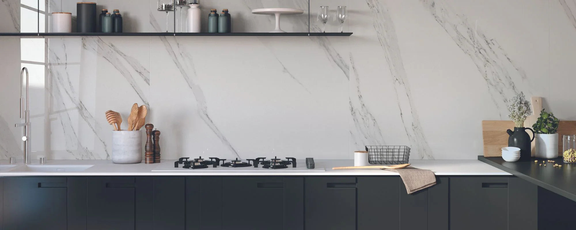
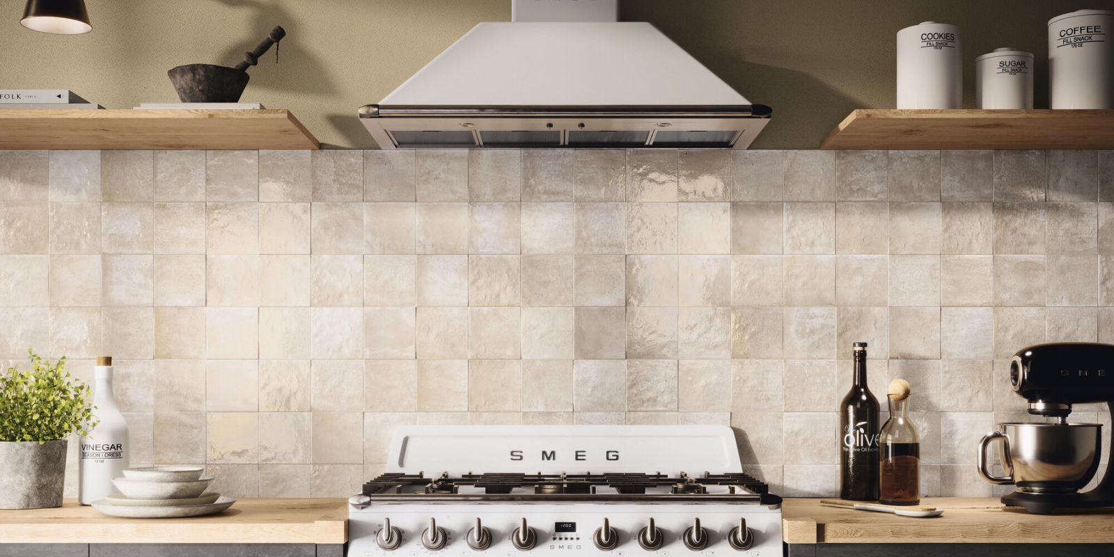
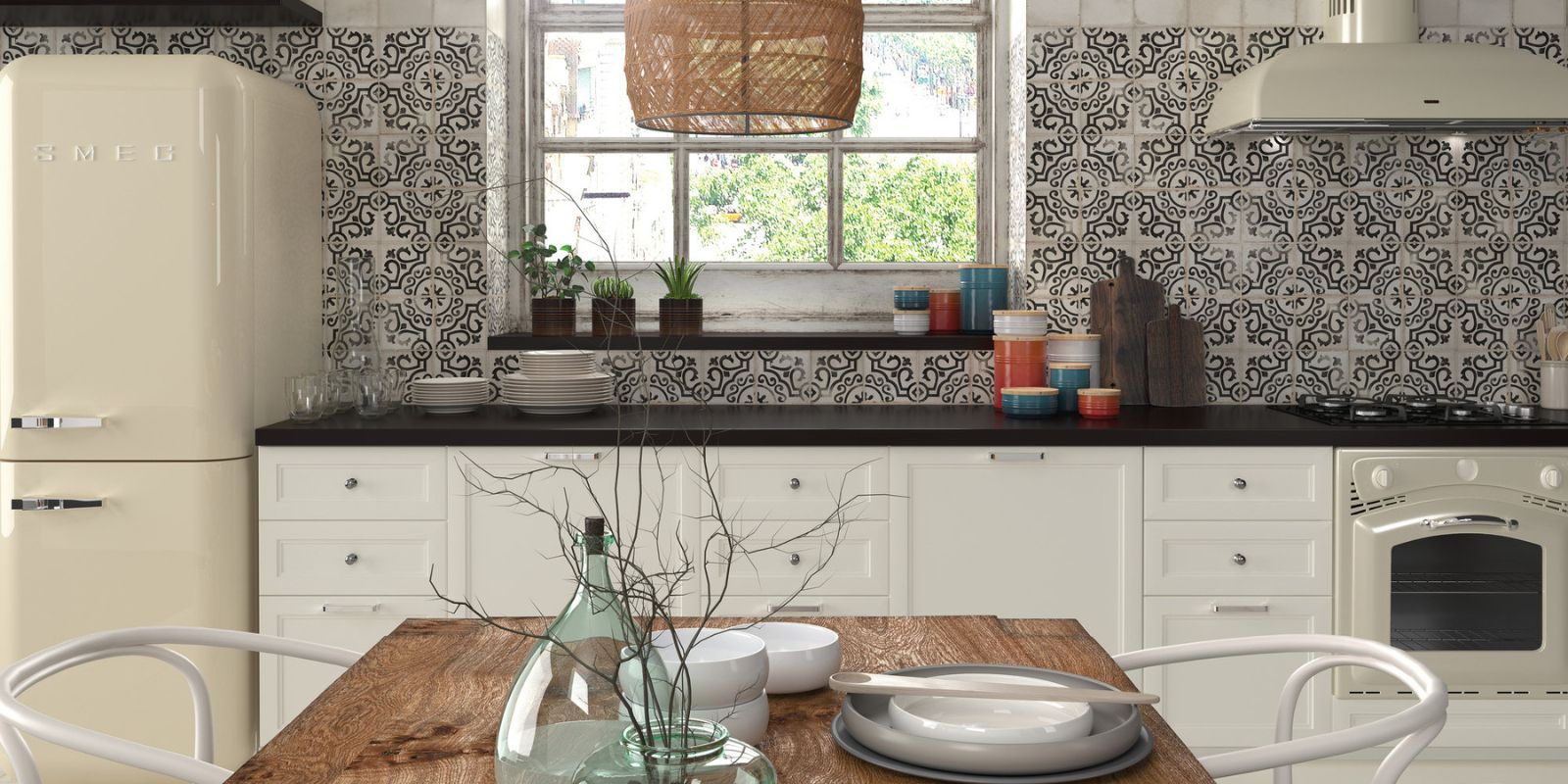
Tiles play a crucial role in enhancing your chosen palette. Incorporating tiles offers endless opportunities for creativity in your kitchen colour palette. Beyond simply choosing a tile colour, consider finish, texture, and pattern to amplify your design. The right combination of these elements can add depth and personality to your kitchen, making the space feel more dynamic and visually interesting. Whether you prefer the sleek shine of glazed tiles or the rustic charm of textured ceramics, tiles can complement your cabinets, countertops, and walls to create a harmonious and inviting environment.
Tile Finishes and Their Effect on Colour Perception
- Gloss tiles reflect light, making colours appear brighter and more vivid, ideal for small kitchens seeking to maximise their sense of space and light.
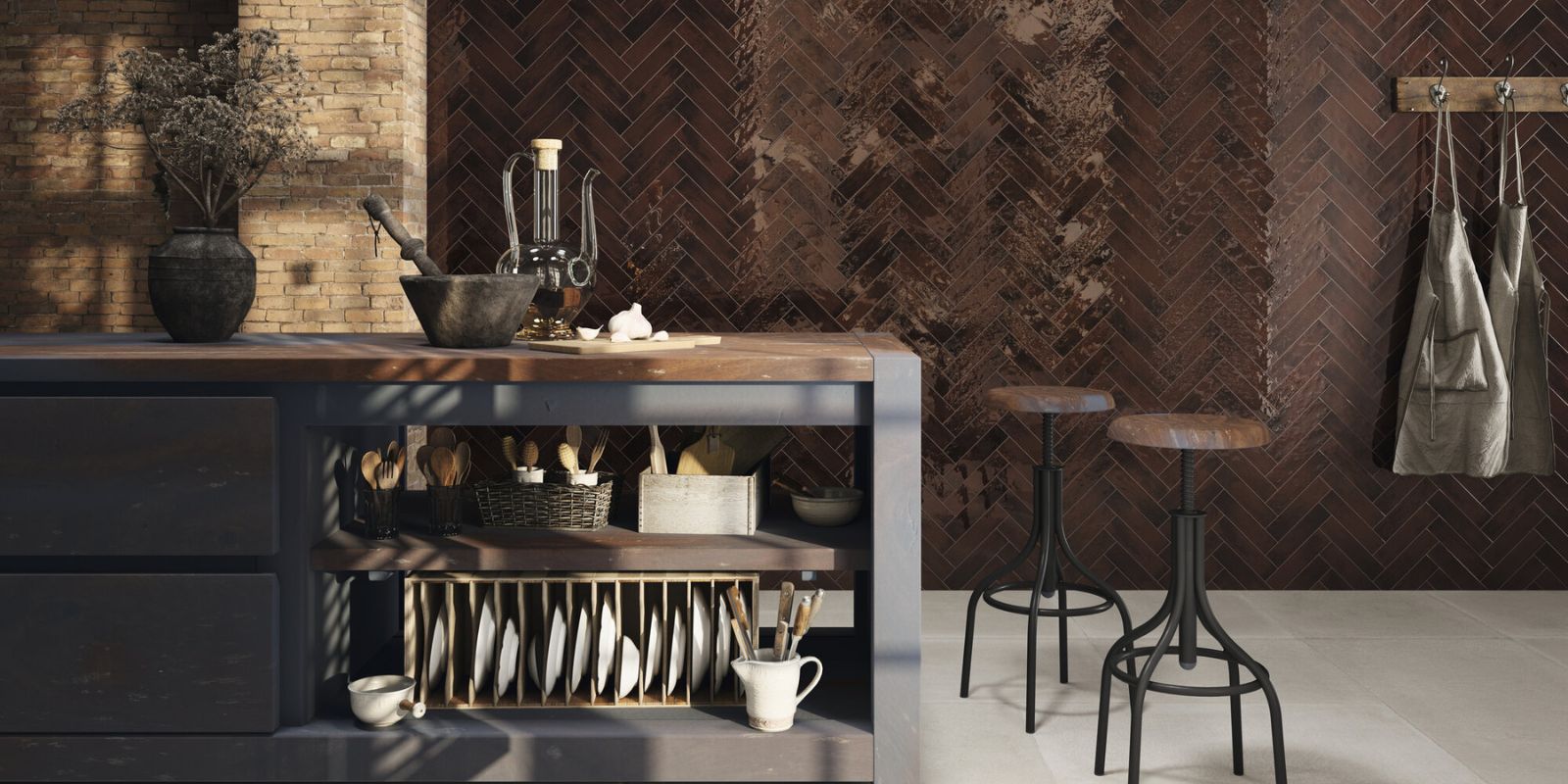
- Matte tiles absorb light and give colours a muted, sophisticated depth, suitable for contemporary or industrial schemes aiming for understated elegance and texture.
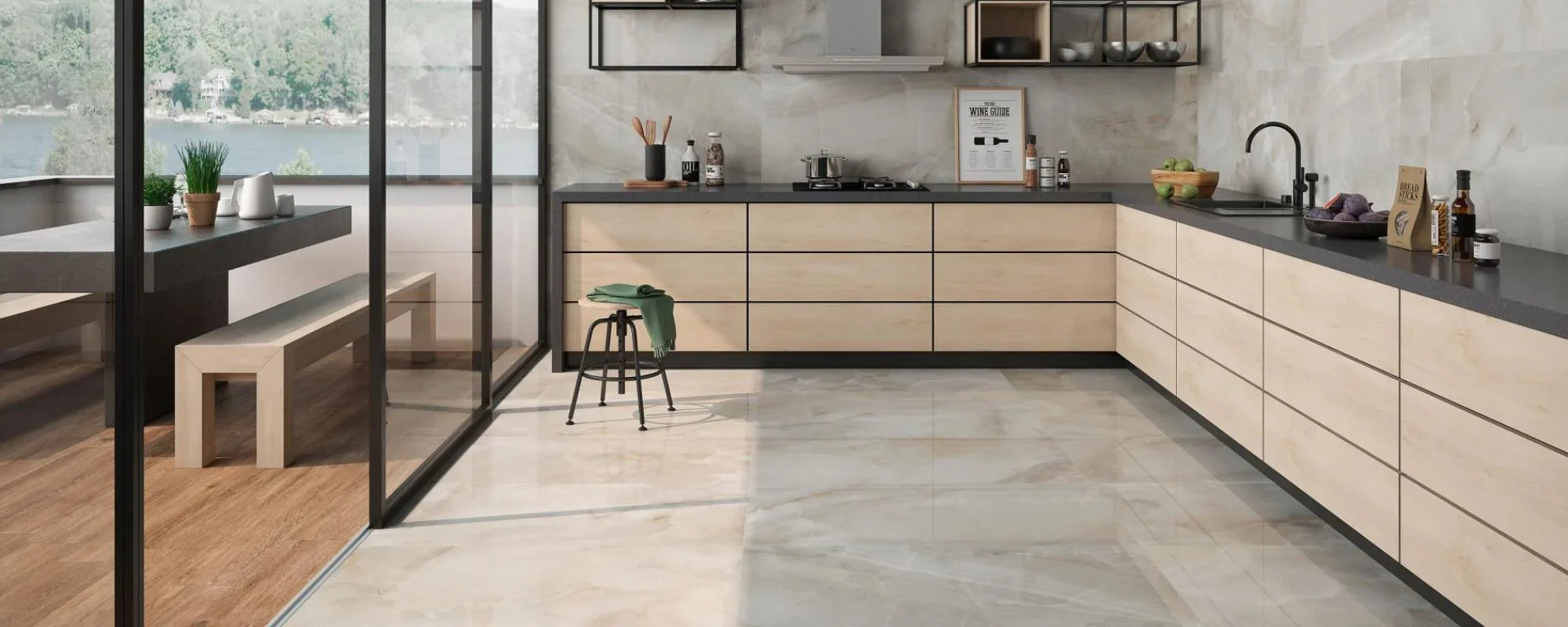
Patterns and Layouts to Add Depth
Explore herringbone layouts, patterned mosaics, or large-format stone-effect tiles in your chosen palette to introduce character and texture without deviating from your colour scheme. These tile patterns can add a dynamic visual interest and tactile dimension to your kitchen, elevating the overall design while maintaining harmony with your selected colours. Additionally, mixing different tile finishes, such as combining glossy and matte surfaces, can further enhance the depth and richness of your kitchen’s colour story, making the space feel thoughtfully layered and inviting.
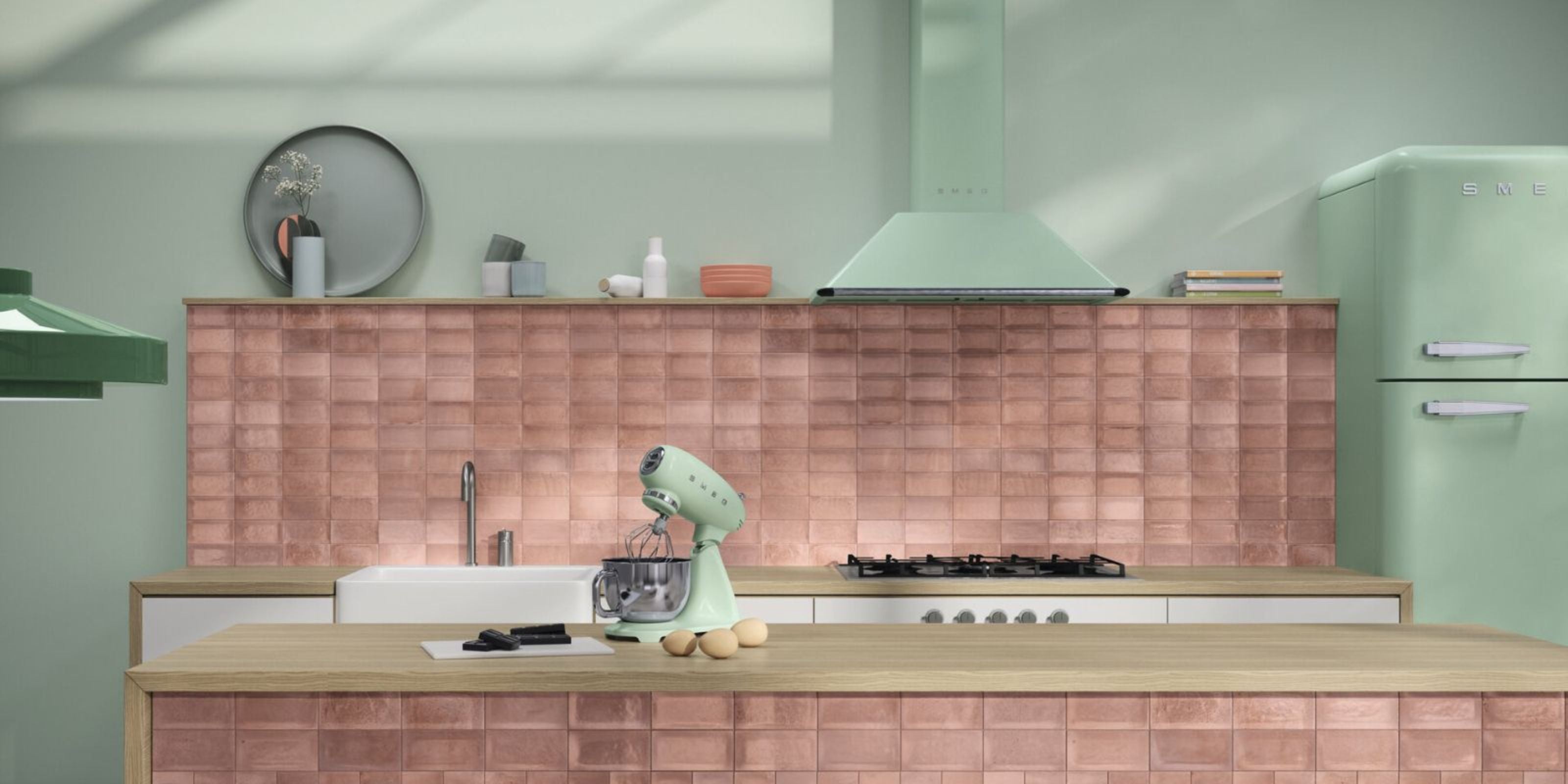
Feature Walls and Accent Areas: Layering Colour for Visual Interest
Once your primary palette is set, consider feature walls or accent areas to add personality without overwhelming the space. Feature walls work well in larger or open-plan kitchens, where a bold splash of colour or patterned tiles can become a stylish focal point. Bold accent areas can also contribute to a modern feel, especially when paired with sleek finishes and minimalist design elements. For a warm, traditional touch, use soft creams on feature walls or accents, which pair beautifully with natural wood tones and create a cosy atmosphere.
When planning feature walls and accents, think about how they fit into your overall kitchen colour schemes to achieve a cohesive look. Choose a wall behind the hob, sink, or kitchen island to highlight. Introducing metallics and natural materials like gold, copper, stainless steel fixtures, wood, or stone can add warmth and texture, balancing bolder colours. For example, a metallic backsplash reflects light, adding subtle shimmer, while wooden shelves or stone countertops bring organic textures that soften sleek cabinetry. When selecting metallic finishes, match warm metals like gold and copper with rich terracotta, pastel pink, or sage green, and cooler metals like stainless steel with midnight blue, black cabinets, or grey tones. Natural wood elements in flooring, shelving, or bar stools add timeless appeal and contrast, making the kitchen feel inviting.
White kitchens are timeless and versatile, and can be enhanced with colourful accents or feature walls to add vibrancy and character. Coordinate kitchen accessories like colourful bar stools and patterned soft furnishings to reinforce your palette and enhance personality. Finally, consider how artificial lighting affects colours, highlighting feature walls, metallic accents, and textures to keep the kitchen vibrant throughout the day.