Grout Colours and Their Impact: The Complete Guide to How They Shape Your Space
Written by: Halima Bapu
Introduction: Why Grout Colour Deserves More Attention
When you’re choosing tiles, it’s easy to assume the hard work ends once you’ve found the perfect shade, finish, or pattern. But in reality, the success of any tiled surface depends just as much on something far smaller and often overlooked: the grout colour, as outlined in the grout colour guide .
Grout might seem like a simple background element, but it plays a vital role in shaping the way tiles look in your home with different grout colours . It can subtly blend tiles into a seamless surface, or it can highlight their shape, pattern, and rhythm. The wrong grout colour can make tiles appear disjointed or even change their undertone, while the right one can elevate the entire room.
The grout colour you choose can dramatically impact the visual aesthetics and overall ambiance of a space, influencing whether the design feels cohesive or intentionally contrasting.
Choosing grout colours is a key design decision that can significantly influence the aesthetic of a tiled space, whether you want the grout to complement or contrast with your tiles.
Because grout options now come in a huge range of shades, from soft chalk whites to warm greys, deep charcoals, earthy browns and even bold colours, choosing the right one is more important than ever. And with that choice comes design power. This guide will help you understand how grout colour interacts with tile colour, texture, pattern, and the overall mood of your interior.
Before you make your final decision, it’s important to be aware of the key considerations when selecting grout colour, which we’ll explore in the next section.
Understanding the Role of Grout in Tile Design
What Grout Really Does (Beyond Holding Tiles in Place)
Grout isn’t just a functional filler between tiles. It creates the visual boundaries your eye reads in any tiled installation, so remember to match the grout . This means grout affects scale, proportion, pattern, and even the atmosphere of the room.
- It defines the shape of each tile
- It influences how clean, bold, or subtle a tiled area appears
- It impacts how much maintenance the surface requires
- It can make a space feel more modern or more traditional
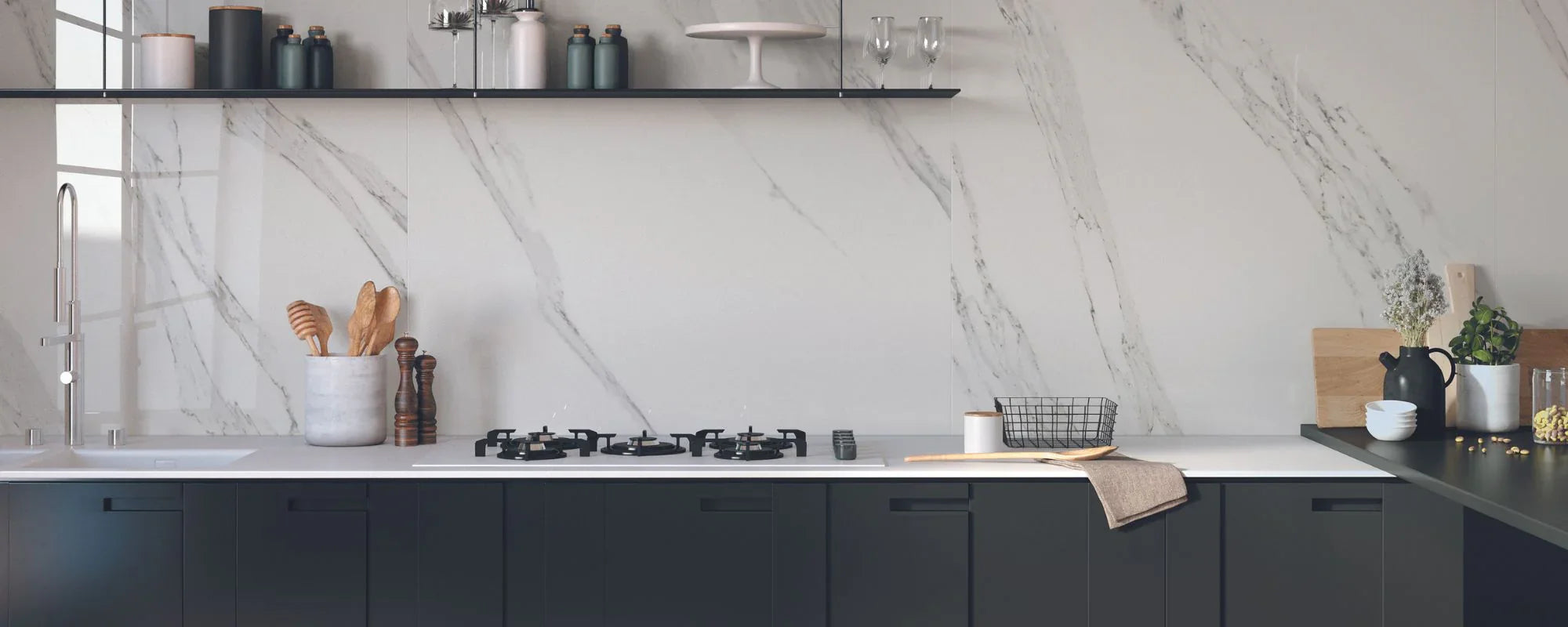
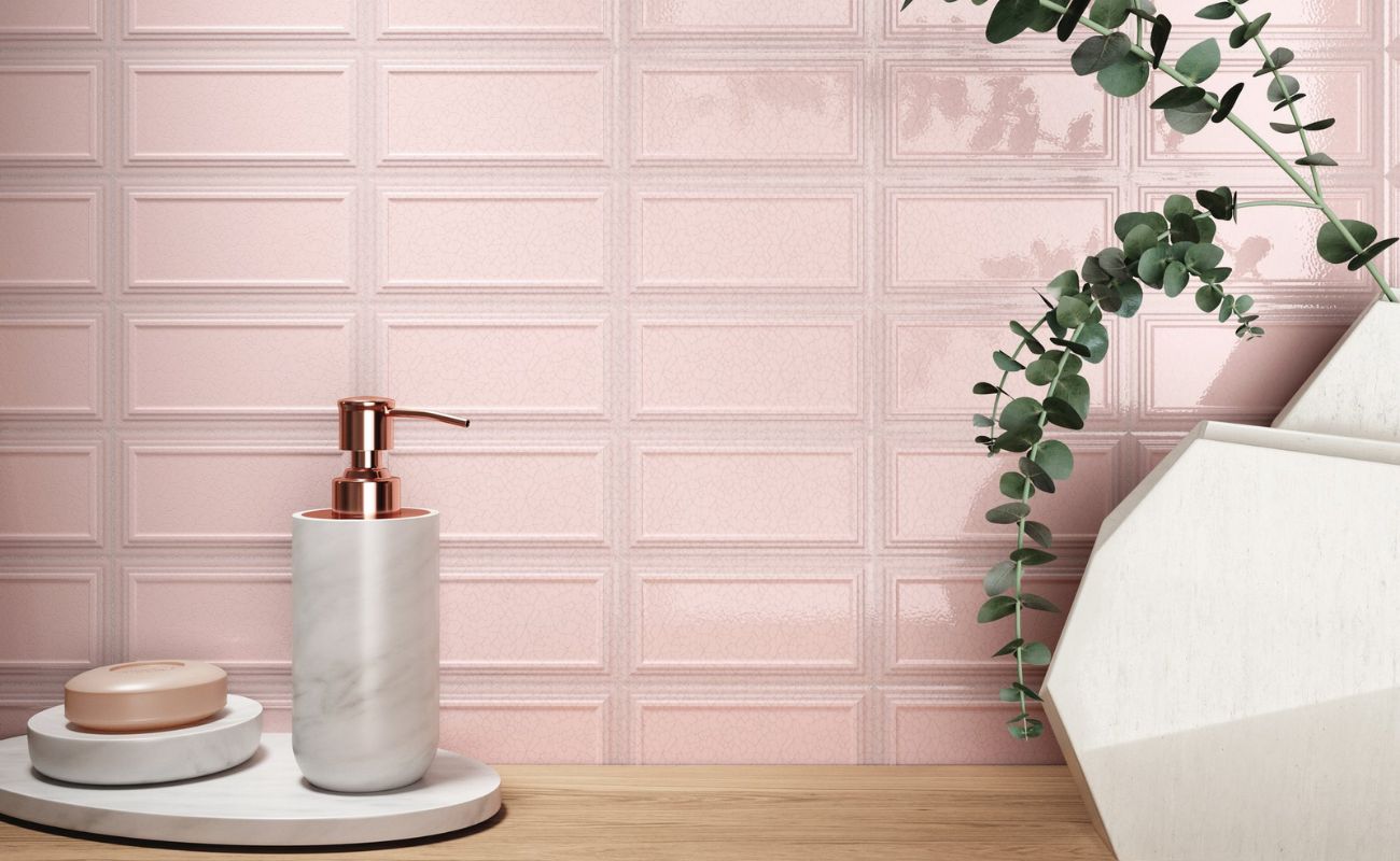
For example, pairing white grout with white tiles can create a soft, airy, continuous look, ideal for minimalist bathrooms or small kitchens where you want the surfaces to feel open. But use the same white grout with deep green or black tiles, and suddenly your grout becomes a feature, drawing crisp, graphic lines around every tile with contrasting grout colours. that enhance the modern and clean aesthetic.
Grout is, in short, a design tool. Understanding how it behaves gives you more control over your final look.
How Tile Colour Influences Grout Choice
Light Tiles: The Delicate Balance Between Clean and Clinical
With white tiles or pale neutrals, grout colour can dramatically shift the aesthetic.
- White-on-white creates a fresh, spa-like feel, but requires more upkeep.
- Soft greys or warm beiges tone down the brightness and add sophistication.
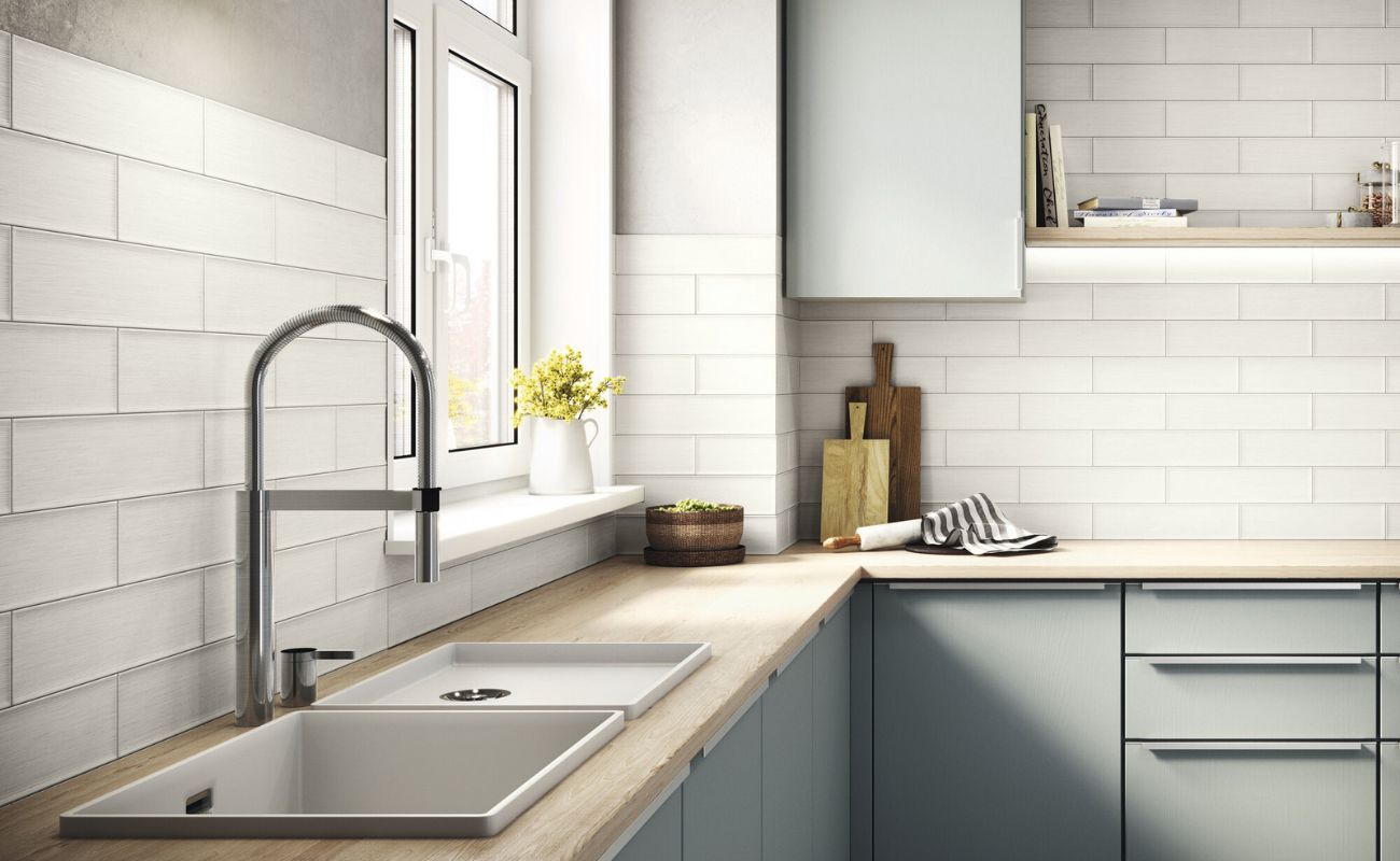
- Dark grout with light tiles immediately introduces contrast, pattern, and definition, perfect for metro tiles or contemporary grid layouts.
Choosing a grout that is slightly lighter than the tile can create a subtle delineation without overpowering the pattern.
White tiles are incredibly versatile, but the grout choice determines whether they look classic, rustic, modern, or bold.
Darker Tiles: Enhancing Drama or Softening the Look
Dark tiles, charcoal, forest green, navy, espresso behave differently.
- Matching grout creates a sleek, seamless effect that feels architectural.
- Lighter grout reveals the tile edges, adding contrast and highlighting shape.
- Tonal grout (just a shade lighter or darker) offers the most sophisticated, low-maintenance middle ground.
Dark tiles with tonal grout also help hide dirt and wear, and using darker shades of grout is particularly effective for concealing dirt and stains, making them practical for high-traffic areas.
Patterned Tiles: When the Grout Needs Restraint
Patterned tiles bring their own drama, so grout should either support the design or intentionally spotlight it.
Choose grout that:
- Doesn’t interrupt the pattern’s flow
- Doesn’t compete with bold colours
- Provides visual grounding without overpowering
Considering the background colour of the patterned tile can help you select a grout that either blends seamlessly with the tile or creates the desired level of contrast for a more dynamic effect. When working with tiles that have multiple colours or complex patterns, such as marble, terrazzo, or wood effects, pay attention to the dominant colour in the pattern—choosing grout that matches or contrasts with this dominant colour can help achieve a seamless or striking look.
For intricate encaustic designs or Moroccan-style tiles, a subtle mid-tone grout is usually the safest and most elegant approach.
Choosing the Best Grout Colour: Expert Advice
Matching vs. Contrasting: Which Is Right for You?
Matching Grout
Ideal for minimalist interiors, large-format tiles, natural stone or stone-effect porcelain, and spa-inspired bathrooms.
For example, a hotel lobby renovation used large-format porcelain tiles with matching grout, creating a seamless, expansive look that made the space feel open and unified. Choosing a grout colour that closely matches the tile helps create a more uniform, expansive appearance, especially with large-format tiles. Benefits include seamless surfaces, fewer visible grout lines, and a calm, understated appearance.
Contrasting Grout
Best for highlighting tile shapes (e.g., herringbone, metro tiles), adding graphic definition, modern industrial styles, and making a bold statement with vibrant grout colours. Benefits include strong visual patterns, high impact, and a contemporary edge.
Tonal Grout
Great for classic interiors, patterned tiles, and low-maintenance spaces. Benefits include soft definition without being overpowering and easier cleaning over time.
How Grout Colour Shapes a Room’s Mood
High Contrast = Bold, Modern, Architectural
High-contrast grout is perfect when you want your tiles to make a statement. Black grout with white tiles evokes classic industrial style, while deep-toned grout with pale colours creates rhythm and structure. Using colourful grout can create a bold, modern, and architectural statement or a dramatic statement , especially in kitchens or on feature walls, adding a vibrant and contrasting visual effect. But high-contrast grout can also make a room feel busier, so it’s best used in areas where you want energy and movement.
Low Contrast = Soft, Seamless, Relaxing
Low-contrast grout blends with the tile, which elongates walls and floors and makes spaces feel larger. Using neutral colours such as white, beige, or grey in grout can help achieve a soft, seamless, and relaxing effect, making it an excellent choice for bathrooms, small kitchens, or any area where you want calm, uninterrupted surfaces.
Room-Specific Considerations: Kitchens, Bathrooms, and Beyond
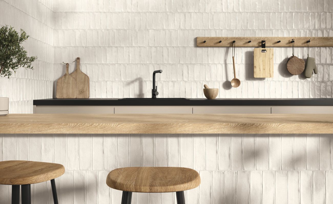
When planning your tiling project, the right grout colour, or the perfect grout colour, can completely change the atmosphere of each room. In kitchens, for example, using a contrasting grout, such as pairing white tiles with grey grout or black grout, can create a striking, contemporary look that highlights the tile pattern and adds a touch of sophistication. This approach is especially popular with classic subway tiles, where the grout lines become a graphic feature that defines the space.
Bathrooms, on the other hand, often benefit from a more subtle approach. Choosing a neutral grout colour like soft grey or beige can create a clean, modern backdrop that feels fresh and relaxing. This is especially effective with lighter tiles, as it maintains a sense of openness while being more forgiving when it comes to maintenance. The level of maintenance required can dramatically change a homeowner's long-term satisfaction with the bathroom's appearance, making it important to consider how grout colour choices impact upkeep. Coloured grout can also be used in bathrooms to create specific visual effects or to complement the overall style of the room, allowing for more creative and personalized design choices.
Beyond kitchens and bathrooms, grout colour choice remains just as important. In living rooms or dining areas, wood effect tiles paired with a matching grout can create a warm, inviting atmosphere that mimics the look of real timber flooring. For outdoor spaces, a darker grout colour is a practical choice, as it helps to hide dirt and stains, keeping your patio or terrace looking its best with less effort. Alternatively, a lighter grout can make outdoor areas feel brighter and more spacious.
Ultimately, the key is to consider the function and mood you want to create in each space. Whether you’re aiming for a bold statement with contrasting grout or a seamless look with matching grout, your grout colour choice will help set the tone for the entire room.
Grout and Tile Size: Proportions, Patterns, and Visual Flow
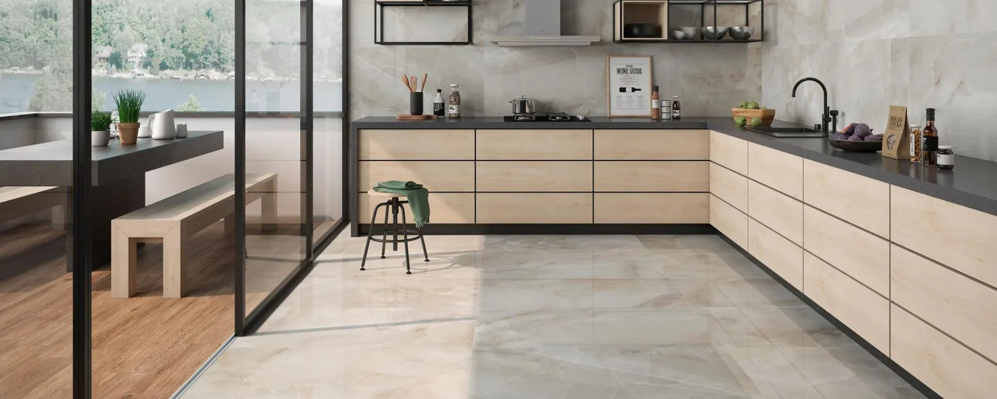
The relationship between tile size, grout lines, and grout colour is key to shaping your space’s aesthetic. Large format tiles with minimal grout lines create a sleek, seamless look that makes rooms feel more expansive and luxurious. A great example is when matching grout colours with large-format tiles, which achieves an uninterrupted, expansive effect—ideal for modern bathrooms or open-plan areas.
Smaller tiles introduce more grout lines, adding texture and interest. Here, grout colour is crucial: contrasting grout with patterned tiles makes designs pop and draws attention to details, while matching grout with solid tiles creates a cohesive look that highlights the tile’s colour and finish.
Epoxy grout works well for both large and small tiles, offering durability and a broad colour range. It’s perfect for high-traffic or stain-prone areas like kitchens and bathrooms.
With natural stone tiles, neutral grout enhances their organic beauty, creating a timeless, inviting atmosphere. For porcelain tiles, bold grout colours can add a modern twist and define patterns, enhancing your colour match. especially on floors or feature walls.
Consider tile size and grout line width alongside tile colour to create a harmonious visual flow that balances style and function in your tiling project.
Practical Considerations: Maintenance, Durability & Lifestyle
Light vs. Dark Grout and Cleaning Requirements
Light grout looks crisp and clean on day one, but it also shows dirt faster, especially on floors or splashbacks behind hobs, adding visual interest . Dark grout hides stains well but can highlight limescale. Tonal mid-tones are the most forgiving.
Pairing certain grout colours with tiles can help achieve a rustic finish, such as using cream or darker grout shades to create a warm, cozy aesthetic. This rustic finish may also influence cleaning requirements, as textured or darker grout can better disguise everyday marks.
Epoxy Grout: High Performance with More Colour Choice
Epoxy grout is:
- Ultra-durable
- Stain-resistant
- Colour-stable
- Great for high-moisture areas
Popular grout brands provide a variety of epoxy grout options in different colours and formulations, making it easier to find the right match for your project.
It’s available in a huge range of colours and is ideal for showers, wet rooms, and kitchens, though installation requires professional skill.
Grout Colour for Popular Tile Styles
Natural Stone Tiles
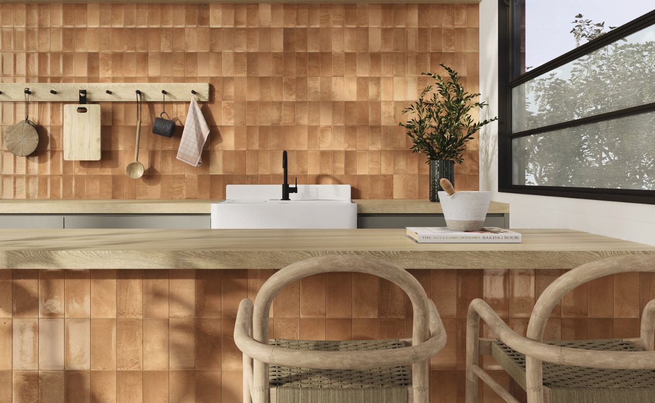
Choose a grout that blends rather than contrasts. Stone is full of organic variation; subtle grout allows it to shine. Using warm tones in grout, such as cream, tan, or brown, can enhance the organic beauty and inviting feel of natural stone tiles.
Wood-Effect Tiles
Warm, soft-toned grouts that mimic real wood joints are the most natural-looking.
Large-Format Tiles
Use matching grout with large-format wall tiles to create an almost slab-like appearance, clean, luxurious, and seamless. This approach is popular in both residential and commercial spaces, such as hotel lobbies or kitchens, to achieve an expansive, uninterrupted look.
Mosaics
Contrasting grout can highlight the mosaic pattern beautifully, but tonal grout ensures the texture stays the hero. For mosaic installations, it is recommended to use a professional tiler to ensure a high-quality finish and optimal grout application.
Final Thoughts: Choosing Grout with Confidence
Grout might be small in size, but its impact on your tile design is enormous. The right grout colour can transform your tiles, influence the atmosphere of your room, and even affect the overall aesthetic and how practical your surfaces are to maintain.
Whether you’re aiming for bold contrast, subtle cohesion, or something creative and personalised, understanding how grout interacts with tile colour gives you the power to create truly intentional design.
To achieve a professional finish, be sure to use the right tools and techniques when grouting your tiles.
At Roccia, we help customers explore grout shades in context with their chosen tiles, because seeing them together in real light makes all the difference. Visit our showrooms in Bolton or Preston to experiment with grout and tile combinations and find the perfect match for your space.