The Psychology of Tile Colour: How Different Shades Change the Way a Room Feels
Written by: Halima Bapu
Introduction
Colour plays a powerful role in interior design, influencing how a space feels as much as how it looks. When used thoughtfully, tile colour can change the mood of a room, affect how spacious it feels, and even influence physiological responses such as heart rate and blood pressure. From calming bathrooms to lively kitchens, understanding the psychology of tile colour helps you make confident design choices that support both function and atmosphere. The psychology of color is something that has been studied for many years now, and colour psychology provides valuable insights into how different tile colours can influence emotions and set the mood within interior spaces. Color psychology is a key concept in interior design and decor, helping to explain how color choices impact emotional responses and the overall ambiance of a room.
Tiles are particularly impactful because they often cover large surface areas, making their colour a foundational design element in home décor. Tile color choices play a significant role in shaping the overall décor and home décor, as they can be used to create specific atmospheres or enhance particular design themes. The psychology of tile colour is not just about aesthetics, but it’s about how specific hues interact with human emotions and behaviours to create an inviting atmosphere tailored to the room’s purpose. Colour selection is frequently left to the end of the architectural design process, but making thoughtful colour choices is essential for achieving the desired psychological and emotional effects in any space. The color wheel is a fundamental tool for understanding color relationships and making informed tile color choices in interior design.
How Colour Psychology Influences Interior Spaces
Colour psychology explores how different hues affect emotions and behaviour by triggering specific emotions and physiological reactions. Color theory helps explain the psychological impact of different colors, showing how certain hues can evoke particular feelings and influence mood in interior design. For example, blue hues have been scientifically shown to reduce heart rate and blood pressure, promoting a calming effect, while red can increase energy levels and stimulate appetite. In interior design, this understanding allows you to strategically select tile colours that enhance the intended mood and function of a space.
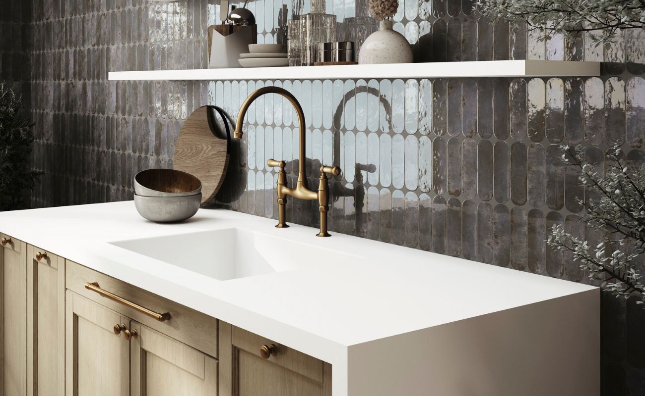
Cooler tones like soft light blues and muted greens tend to feel calming and structured, ideal for bedrooms and bathrooms where relaxation is key. Warmer shades such as pastel yellow, orange, and terracotta create warmth and energy, perfect for kitchens and social areas. Neutral colours like grey and beige serve as a perfect backdrop, offering balance and versatility without overwhelming the senses. By using different colors, you can evoke a specific mood in each room, tailoring the atmosphere to suit its purpose.
When selecting tile colours, it’s essential to consider not only personal preference but also the psychological impact of colours, how the space is used, and the interaction with other design elements such as lighting and furnishings. Ultimately, choosing tile colors for your décor should be based on personal preference and how well they match the rest of your décor.
Understanding Colour Through the Colour Wheel
The colour wheel remains an indispensable tool for creating harmonious interiors by illustrating relationships between colours. Colour theory explains how complementary colors, those opposite each other on the wheel, create vibrant contrast and eye-catching combinations, while analogous colours, those adjacent on the wheel, offer more subtle, cohesive schemes.
Applying the colour wheel to tile selection can help you design a feature wall or flooring that balances contrast and harmony, ensuring that tiles, walls, and décor work together seamlessly. It’s important to consider not just the base colour, but also the specific tone and shade of each tile, as these nuances can significantly affect the mood and harmony of the space. For example, pairing deep blue tiles with warm orange accents creates a dynamic yet balanced space, while using soft green and blue tones side by side promotes tranquility. The colour wheel can also guide the selection of red and pink tiles, helping you achieve specific emotional effects, such as energy, passion, or warmth, by choosing complementary or analogous hues for a desired atmosphere.
The Role of Natural Light in Tile Colour
Natural light profoundly affects how tile colours are perceived, with variations depending on room orientation and time of day. South-facing rooms receive abundant warm sunlight, which can enhance the vibrancy of warm colours like sun-inspired yellows and rich oranges, making these hues feel even more inviting. Conversely, north-facing rooms often have cooler, diffused light that can mute colours, making pastel yellow and crisp, bright whites excellent choices to brighten the space and enhance light reflection, making a room feel more spacious.
The finish of tiles also interacts with light, glossy tiles reflect more light, amplifying colour vibrancy and creating a lively atmosphere, while matte or textured finishes absorb light, lending a more subdued and cozy feel. When planning a painting project or tile installation, it’s important to consider how natural light and room orientation will affect the perception of colour. Testing tile samples under different lighting conditions is a crucial design tip to ensure the chosen colour maintains the desired effect throughout the day.
As a design tip, remember that light colors make a room appear larger and more spacious, while dark colors create a more intimate environment. For additional design tips, consider incorporating beige and brown tiles into your interior décor, these versatile shades can complement a wide range of styles and set a warm, inviting mood in any space.
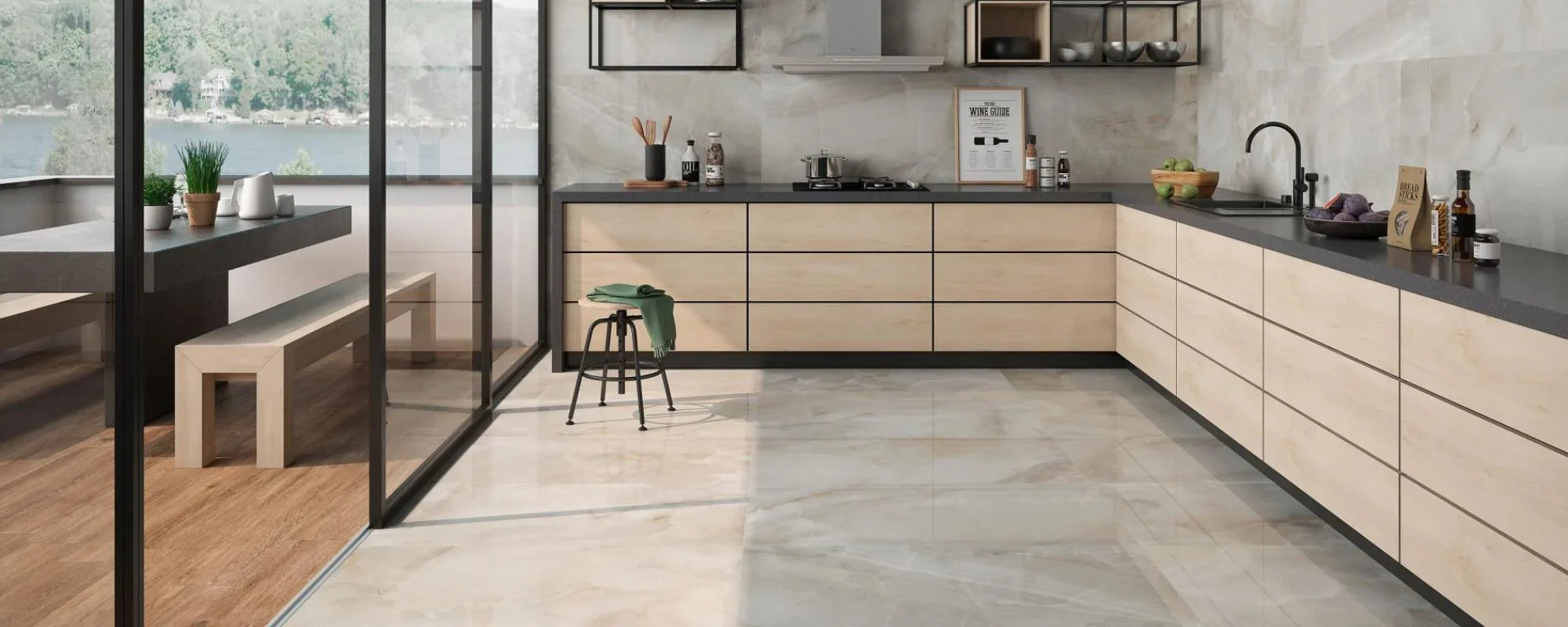
Choosing Tile Colours by Room Function
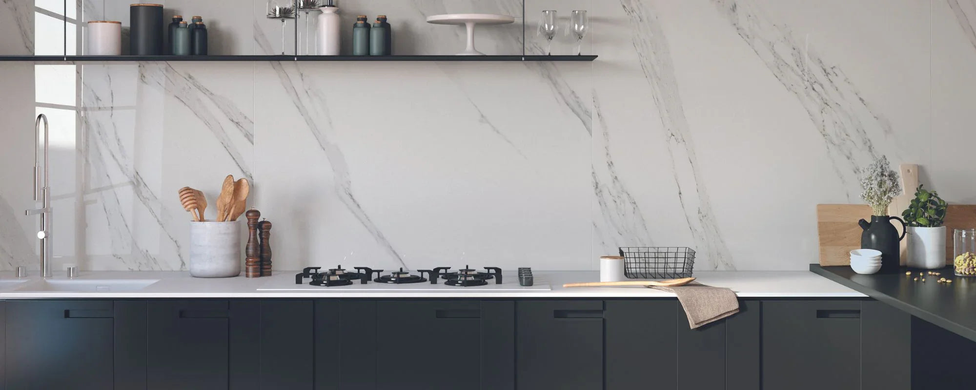
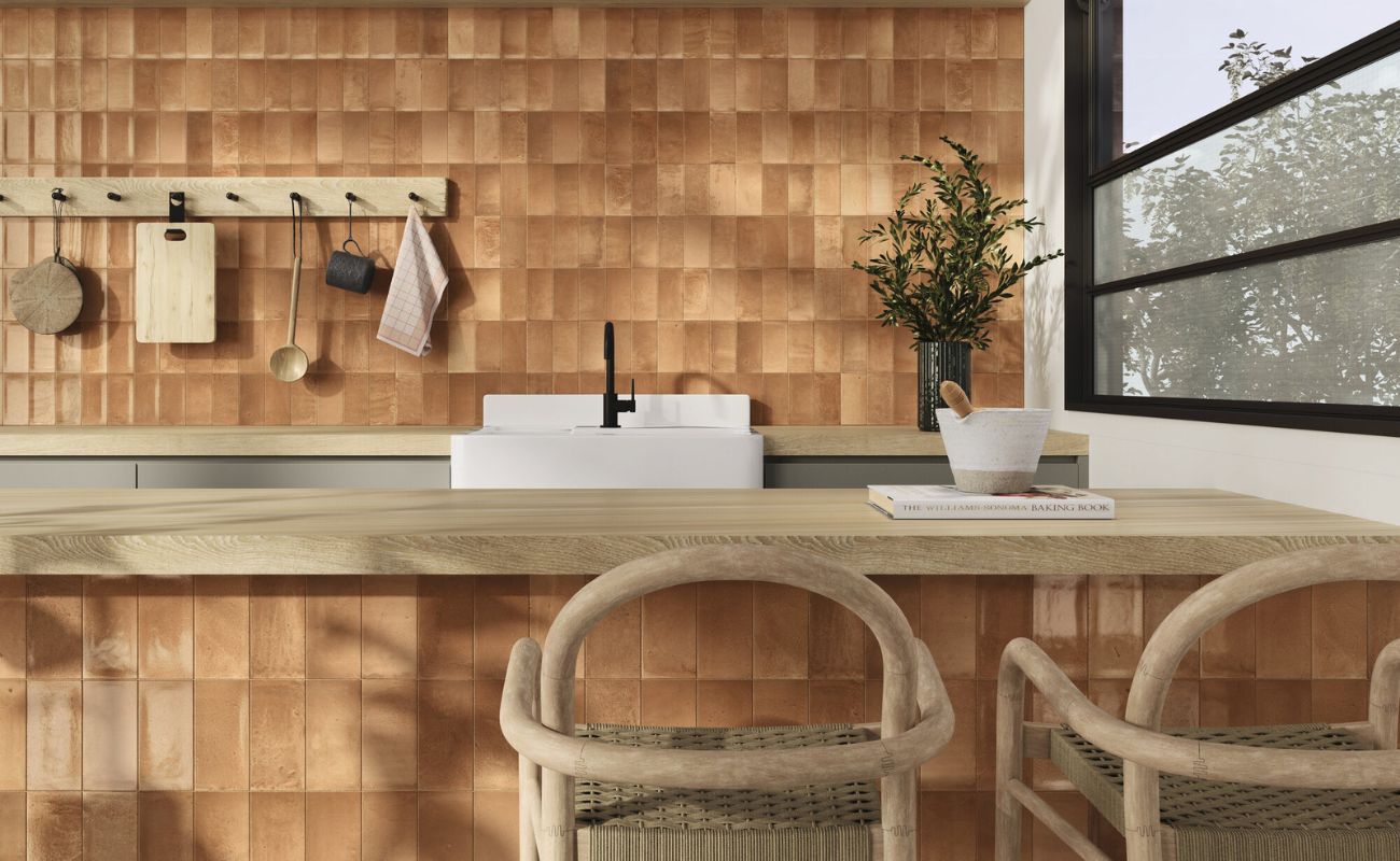
Every room’s function influences the ideal tile colour palette, as different colours support different activities and emotional states. In spaces like the bathroom and bedroom, colour choices truly matter, as they can transform these areas into calming retreats or energising environments. For example, warm colors such as reds, yellows, and pinks can be used in kitchens and living rooms to create a sense of energy and warmth. Design decisions about tile colour and window treatments matter because they significantly influence the mood and atmosphere of each space.
Looking ahead, a key trend for 2026 is using a single tile color across floors, walls, and ceilings to create a seamless, unified environment. This approach can make any room feel more cohesive and visually striking, highlighting the ongoing evolution of interior design trends over the years.
Calm and Restful Spaces
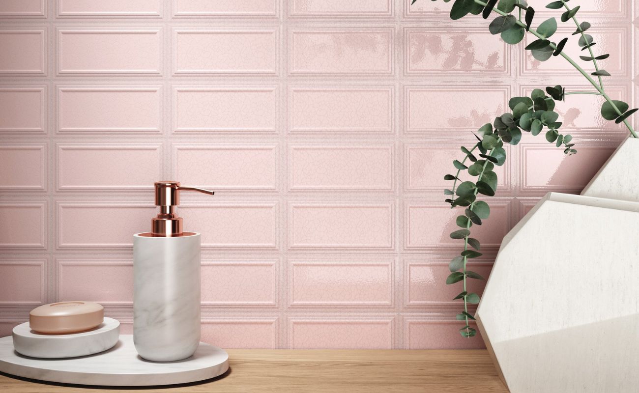
Bathrooms and bedrooms benefit from cool, calming colours like light blues, soft greys, and muted greens. Choosing the right shade of blue tile can evoke a specific mood in these spaces, helping to create the desired emotional atmosphere. These hues lower heart rate and blood pressure, fostering relaxation and restful sleep. Green also symbolises renewal and promotes relaxation, making it especially effective in home offices to reduce eye strain. Incorporating subtle design elements such as textured tiles or soft patterns can enhance this calming effect without overwhelming the senses.
Social and Energetic Areas
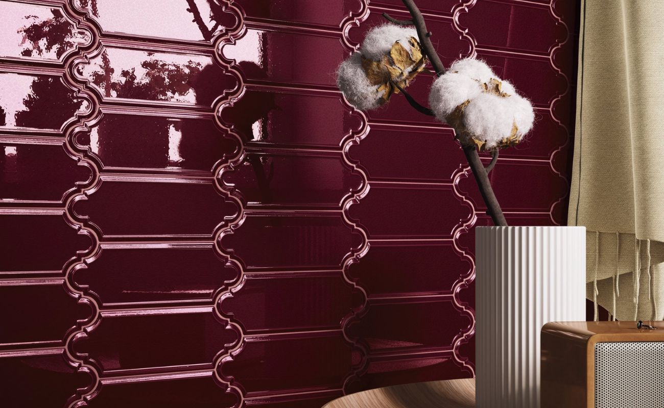
Kitchens and living rooms thrive with warm colours such as pastel yellow, orange, and terracotta, which stimulate energy and appetite. Bold colours like red, purple, and orange can be used to create dramatic effects in social spaces, adding vibrancy and impact to the environment. These hues create an inviting atmosphere that encourages social interaction and vitality. Incorporating red tile as a key element in home décor, such as an accent or feature wall, can make a striking visual statement and evoke specific moods within living spaces. However, using these colours in large quantities can be a bit overwhelming, so balancing them with neutral tones or using them as accent tiles on a feature wall can maintain harmony.
How Different Colours Affect Mood
Each colour carries distinct psychological associations and physiological effects:
- Blue: Known for its calming effect and ability to reduce blood pressure, blue is a great addition to bathrooms and bedrooms seeking tranquility.
- Green: Symbolizing renewal and balance, green tiles connect interiors with nature and promote emotional well-being.
- Yellow: Evoking sunshine and joy, pastel yellow tiles stimulate mental activity and create a vibrant, uplifting environment.
- Red and Orange: These warm colours increase energy levels and heart rate, ideal for lively spaces but best used in moderation to avoid overstimulation.
- Purple and Pink: Purple adds richness and creativity, while pink inspires balance and imagination, both useful in bedrooms or creative spaces.
- Grey: A versatile and modern neutral, grey provides a perfect backdrop that enhances other colours and adds sophistication. For 2026, warmer tones are declining in popularity, making grey tiles a contemporary choice for balanced atmospheres.
- White: Symbolizing cleanliness and order, white tiles visually enlarge spaces and promote a crisp, fresh feel. White also promotes feelings of cleanliness, order, and safety.
- Black: Associated with luxury and drama, black tiles create striking contrasts but can feel oppressive if overused. Black tiles are also considered a traditional choice, offering a classic and timeless appeal in interior décor.
2026 trends show a preference for warmer, sun-kissed colors that encourage emotional well-being.
Creating a Cohesive Colour Scheme with Tiles
A well-designed colour scheme balances dominant and accent colours, often following the 60–30–10 rule. Tiles usually take the dominant role, so their colour choice is pivotal. Incorporating complementary colors and considering other design elements such as wood finishes, lighting, and furniture ensures a cohesive and inviting décor.
For example, pairing warm wood tones with soft grey tiles creates a balanced, natural look, while adding a vibrant purple or pink accent tile can introduce an eye-catching feature without overwhelming the space.
For more inspiration, explore galleries or online resources like Pinterest to discover creative tile colour combinations and spark new ideas for your own space.
Using Tiles to Enhance Light, Space, and Texture
Beyond colour, tile finish and texture significantly influence a room’s feel. Glossy tiles reflect more light, enhancing brightness and making spaces feel larger and more vibrant. Matte or textured tiles absorb light, creating depth and a softer, more intimate atmosphere.
Strategic tile placement can define zones within open-plan spaces or highlight architectural features, adding subtle visual rhythm. For example, a textured tile feature wall in a muted colour can create a focal point that adds sophistication without detracting from the overall calmness.
Applying Colour Psychology in Real Homes
Colour psychology is most effective when applied practically, considering daily living needs. Tiles selected with an understanding of colour theory and emotional impact can transform a space into a sanctuary or a lively hub, enhancing well-being and comfort.
Combining colour awareness with thoughtful material choices and finishes allows interiors to feel balanced, inviting, and timeless, spaces that support life and mood as much as style.
Designing with Emotion in Mind
Ultimately, successful interior design recognises that how a space makes you feel is as important as how it looks. Tile colour, when chosen with expertise and intention, subtly influences emotion and physiological responses, fostering well-being and making a house truly feel like a home.
Bringing It All Together
Understanding the psychology of tile colour empowers you to design interiors that are emotionally supportive and aesthetically harmonious. By considering natural light, room function, colour relationships, and design elements, tiles become a versatile tool to create spaces that are calm, vibrant, and welcoming.
With the right knowledge and approach, tile colour transforms interiors into environments that feel as good as they look, inviting, balanced, and full of life. Embracing the fun and creativity of colour choices allows you to make your home a reflection of your personality and mood, ensuring every room feels just right.