When it comes to interior design, one of the most powerful tools you can use is understanding the difference between warm vs cool interiors.
At first glance, it may seem like a simple choice between warm colors and cool colors, but in reality, it’s far more nuanced. The balance of warm and cool tones influences how a space feels, how light moves through it, and how comfortable it is to live in.
Whether you’re choosing paint colors, tiles or surfaces, understanding warm vs cool colors helps you create a home that feels cohesive, calm and intentional.
Understanding Warm vs Cool Interiors
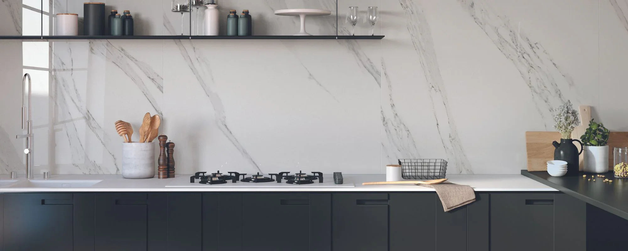
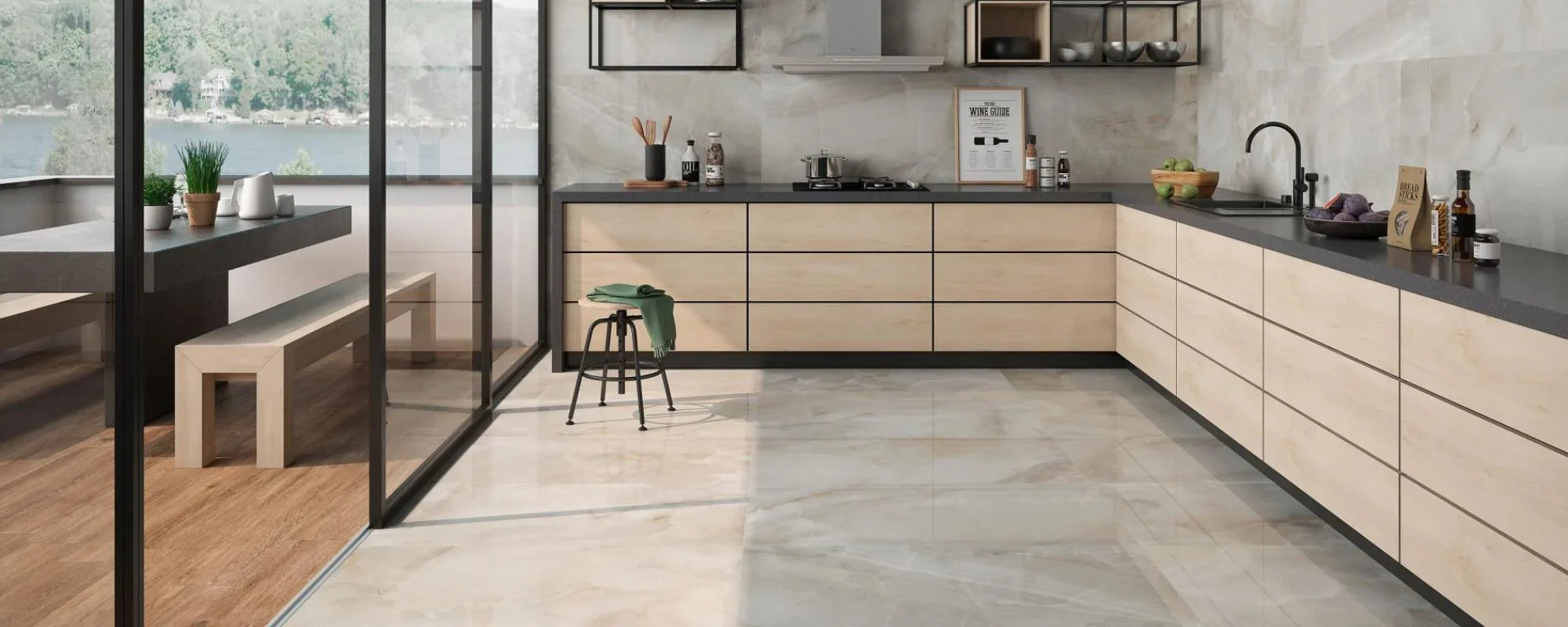
The foundation of warm vs cool interiors begins with the color wheel. Warm hues, such as reds, yellows and oranges, tend to feel inviting and energising, while cool hues, including blues, greens and cool grays create a calmer, more restrained atmosphere.
But the real difference lies in undertones.
Warm undertones add softness and warmth, often found in warm neutrals like beige, sand or cream. Cool undertones, by contrast, appear in shades such as cool white, grey or light blues, creating a more crisp and airy feel.
This is why two similar colors can feel completely different in the same room — subtle undertones shift the entire mood.
The Role of Natural Light and Artificial Lighting
Light plays a defining role in how warm and cool tones are perceived.
A north facing room typically receives cooler light, which can make colours feel slightly muted or flat. In these spaces, warmer tones can help counteract cooler light and create a more welcoming feel.
South facing rooms, on the other hand, benefit from more light throughout the day. This allows cooler tones to work beautifully, balancing the brightness and preventing the space from feeling overly warm.
Artificial lighting also has an impact. Warmer bulbs can make cool paint colors feel softer, while cooler lighting can emphasise crispness in a decorating scheme. This is why testing paint samples at different times of day is essential when choosing the right paint colour.