How to Plan a Cohesive Colour Scheme for Your Home
Written by: Halima Bapu
Planning a cohesive colour scheme can feel like one of the most overwhelming parts of decorating a house. It’s easy to choose a paint colour you love for one room, but making sure all the colours work together across different rooms is where people often start to worry they’ll get it wrong.
The key is to think of your home as one connected space, not a series of separate decisions.
A cohesive colour scheme isn’t about using the same colour everywhere. It’s about creating a sense of flow, where shades, tones and materials work harmoniously, even when you’re using multiple colours.
Start with the Feeling You Want to Create
Before choosing a single wall colour, think about how you want your home to feel.
Colour has a powerful emotional impact. Warm tones like red, pink, yellow or brown tend to feel inviting and energetic, while cooler shades like blue and green paint create a calmer, more serene atmosphere. Exploring the meaning of different colours in your home helps you understand how these choices shape not just the look of your home, but how it feels to live in.
This is where many interior designers begin, not with colour charts, but with mood.
Do you want your space to feel soft and muted? Bright and fresh? Calm and minimal? That direction will guide every colour decision that follows.
Think About the Whole House, Not One Room
One of the most common mistakes is decorating one room at a time without considering how it connects to the rest of the house.
Instead, step back and look at your home as a whole. Pay attention to how rooms flow into one another, especially through the hallway, doorways and open-plan spaces.
Using a consistent colour story throughout your home creates a subtle connection between spaces. This allows you to use different colours in each room, while still maintaining a cohesive scheme.
Choose a Hallway Colour First
A simple but effective starting point is your hallway.
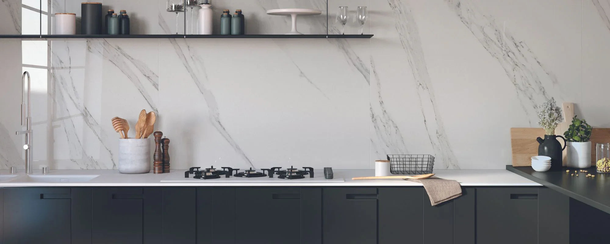
Because it connects so many areas, choosing a hallway colour first gives you a foundation for the rest of your palette. Every other shade in your home should either complement or gently contrast with this base, and thoughtful hallway floor tile choices can reinforce that sense of flow.
Soft neutrals, like cream, warm grey, or muted beige, are great places to start. They allow other colours, materials and furniture to sit comfortably alongside them without clashing.
Build a Colour Palette That Feels Balanced
Rather than choosing colours randomly, aim to create a balanced colour palette.
A good rule is to limit your palette to around five or six colours across the entire home. This prevents the space from feeling overwhelming and helps everything feel more intentional, especially when you’re planning the perfect colour palette for your kitchen or exploring modern kitchen colour schemes that still work with the rest of your home.
These might include:
- One main base tone
- A couple of secondary shades
- One or two accent colours
- Supporting neutrals
When colours are repeated and balanced, they create a natural sense of cohesion.
Understanding Colour Relationships
Using a colour wheel can help you find combinations that feel naturally harmonious.
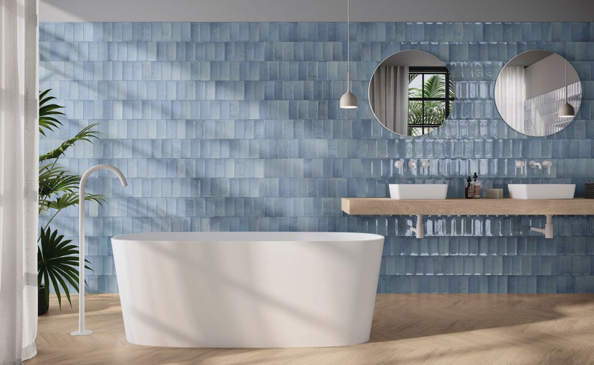
- Monochromatic schemes use variations of one colour, for example, different shades of blue, to create a calm, minimal look
- Analogous schemes combine colours that sit next to each other, like green, blue and muted teal, creating a soft and cohesive blend
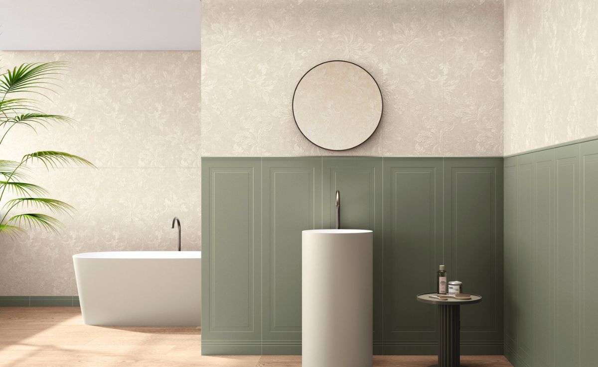
Pastel colours are particularly easy to work with, as their pale undertones mean they naturally complement each other. This makes them ideal for creating a gentle, harmonious scheme, especially in spaces like kitchens and bathrooms where tile-based colour schemes can subtly echo those soft tones.
Keep Saturation and Tone Consistent
One of the easiest ways to disrupt a cohesive scheme is by mixing colours with very different intensity levels.
For example, pairing a very bold, bright colour with something extremely muted can feel slightly off balance. Instead, try to keep a consistent tone across your palette, whether that’s soft and understated or deeper and more dramatic.
This doesn’t mean everything has to match exactly, but the colours should feel like they belong together.
Use Variation to Add Depth
A cohesive colour scheme doesn’t mean every room looks identical.
In fact, variation is what gives a home personality.
You might:
- Use lighter and darker versions of the same colour
- Introduce subtle changes in tone between different rooms
- Layer colours through furniture, rugs, curtains and accessories
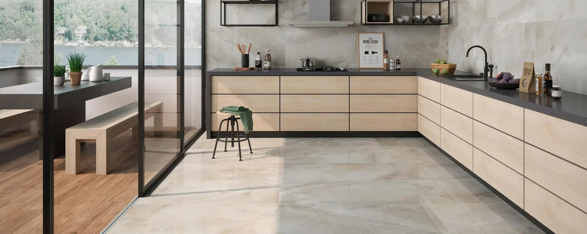
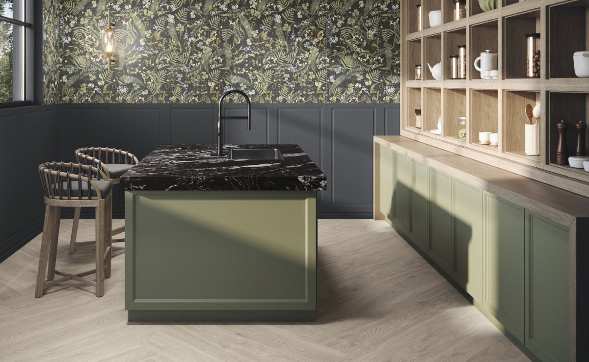
For example, a soft green paint in one room might be echoed through textiles or tiles in another, creating a quiet link between spaces. In a kitchen, carefully chosen tile patterns that transform your space and floor tiles that complement a cream kitchen can both carry your colours from one area to the next.
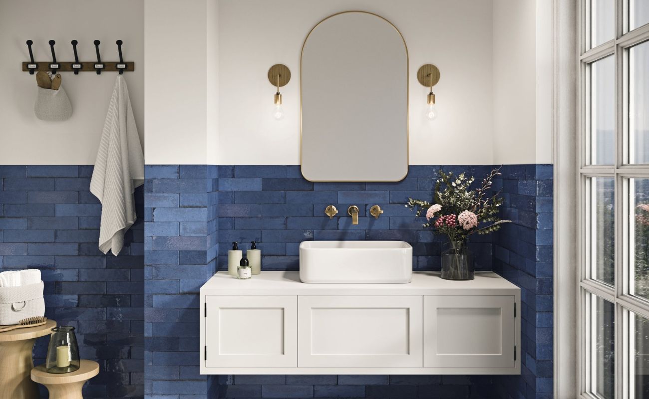
Repeat Accent Colours for Subtle Cohesion
One of the simplest ways to tie a scheme together is by repeating an accent colour throughout the home.
This could be a soft pink, a muted blue, or a deeper green, used in small ways across different rooms; for instance, you might use the same shade to tie together soft furnishings and tiles, drawing on ideas about the power of pink in home décor and its warm, modern versatility throughout the home.
You don’t need to use it on every wall. It might appear in:
- A rug in the living room
- Curtains in a bedroom
- Accessories in a downstairs loo
- Or even inside cupboards or a wardrobe
These small touches create connection without making the scheme feel repetitive.
Add Colour in Unexpected Places
If you want to introduce personality without overwhelming the space, think about where colour can appear beyond the walls.
Painting the inside of cupboards, alcoves, or even the back of shelving is a great way to add interest. These moments feel more playful and personal, while still keeping the main scheme calm and balanced.
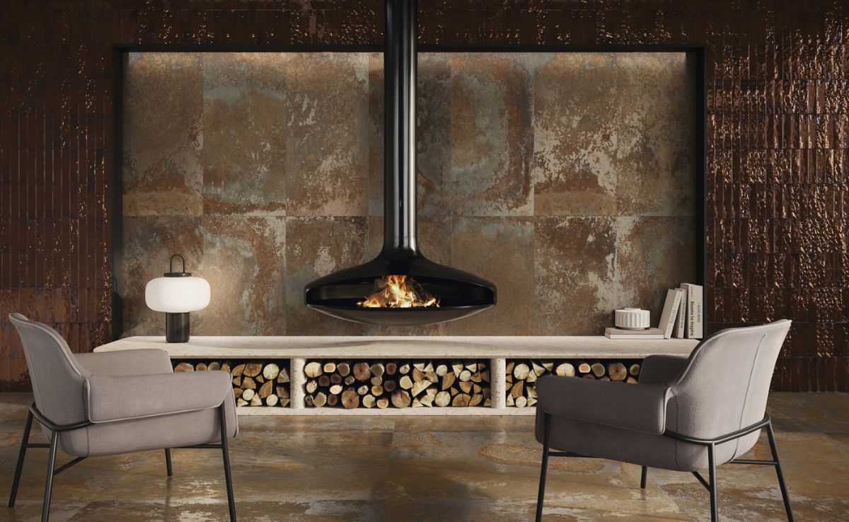
Let Materials Guide Your Choices
Colour always interacts with materials.
Wood tones, tiles, flooring, wallpaper, and furniture all influence how colours appear. A warm wood floor will affect how a cream wall colour reads, just as much as natural light will.
When planning your palette:
- Place paint samples next to materials
- Look at how tones complement or contrast
- Consider how light changes throughout the day
This ensures your colours work together in real life, not just in isolation.
Don’t Forget the Details
Details often make the biggest difference in creating cohesion.
Painting all the woodwork in a consistent tone, choosing finishes that match across rooms, or repeating similar textures helps everything feel more considered.
Even small decisions, like the colour of your front door or the finish of your fixtures, contribute to the overall sense of harmony.
Balancing Bold and Neutral
Neutrals are often the foundation of a cohesive colour scheme, but that doesn’t mean your home has to feel plain.
The key is balance.
Use neutrals to ground the space, then layer in bolder colours more selectively. This keeps the scheme calm while still allowing personality to come through.
For example, a bold wall colour might work beautifully in one room, while the rest of the home stays softer and more muted.
A Note on Cultural Meaning and Personal Style
It’s also worth remembering that colours can carry different meanings depending on culture and context.
For example, white is often associated with purity in Western interiors, but may represent mourning in other parts of the world. While this may not always influence your choices directly, it highlights how personal and subjective colour can be, even in rooms where people often play it safe, such as when deciding how much colour to use in the bathroom.
Ultimately, your home should reflect your own style, not just trends or rules.
Final Thoughts: Creating a Home That Feels Connected
Planning a cohesive colour scheme isn’t about getting everything perfect, it’s about creating a sense of balance.
When colours are thoughtfully chosen, repeated subtly, and supported by materials and light, your home begins to feel naturally connected.
The best advice is to keep things simple:
- Choose a clear direction
- Limit your palette
- Repeat colours where it makes sense
- And test everything in real conditions
When everything works together, your home doesn’t just look better, it feels better too.